Neuron
Neuron
Neuron, is an innovative platform designed specifically for neuro-divergent individuals, offering an inclusive and accessible learning environment as well as a assistive organizing tool.
Client
Neurodiversity Belgium
DELIVERABLES
UX Conceptual Prototype
Year
2024
Role
Product innovator
Neuron — learning that adapts to how your brain works
Neuron is an innovative platform designed specifically for neurodivergent individuals, offering an inclusive and accessible learning environment as well as an assistive organizing tool.
Most interfaces overwhelm the people they should support
Neurodivergent users often experience cognitive overload, difficulty focusing, and heightened sensory sensitivities when using traditional digital interfaces. Most tools aren't designed for the specific needs of people with ADHD, autism, or dyslexia — so accessibility and satisfaction drop exactly where they matter most.
The opportunity: an adaptive, empathetic experience that offers customizable sensory input, intuitive navigation, and emotional support — helping people focus and learn with less strain. Online learning was the perfect place to prove it, because learning is where overload hurts the most.
Grounded in expertise and lived experience
I approached this as a human-computer interaction question, not a visual one. The research had three strands: an expert interview with a specialist on neurodiversity; a competitor analysis of tools already built for neurodivergent users (Brain in Hand, CogniFit, Avaz, Flare, Mightier, Otsimo, Thrive); and a synthesis of the recurring needs across them.
"Neurodivergent users require adaptive, user-centered applications that provide customizable sensory input, intuitive navigation, and emotional support — to manage tasks, focus effectively, and reduce cognitive strain."— Problem statement, research synthesis
Four needs surfaced again and again. They became the lens for every design decision that followed:
Four principles, straight from the research

Neuron: neuroscience, made calm and clear
Neuron turns the principles into a real learning experience. A learner starts on a soft knowledge map — 'I want to learn' — and opens a topic. Inside, a 3D model anchors the subject, and the lesson can be read, heard, or explored. The tagline says the promise plainly: learn at your pace, without stress.


Explore by keyboard, not just by mouse
The idea I'm proudest of: you don't have to hunt around a 3D model with a mouse. Each part of the figure is numbered, and you can move focus with the keyboard — land on a part, and its explanation appears right beside the model. For a learner with motor differences, low vision, or anyone who finds precise mouse-work draining, the content is reachable a calmer way.

It pairs with the other multimodal affordances — text-to-speech audio and a full transcript on every lesson — so the same neuroscience is available however a given brain prefers to receive it. That's inclusive design as a default, not an afterthought bolted on at the end.
What's designed, and what's still ahead
Neuron is a research-driven prototype, and I'd rather be clear about its edges than imply a finished product.
From principled prototype to validated product
Designing for the edges makes it better for everyone
Building for neurodivergent learners changed how I design for anyone. Reducing clutter, offering the same content in more than one form, removing timers and pressure, setting a calm and predictable tone — none of that only helps a 'special' group. It's just better, more humane design. Neuron is where I learned to treat accessibility and empathy as the starting point of a product, not a checklist at the end.
Neuron
Neuron, is an innovative platform designed specifically for neuro-divergent individuals, offering an inclusive and accessible learning environment as well as a assistive organizing tool.
Client
Neurodiversity Belgium
DELIVERABLES
UX Conceptual Prototype
Year
2024
Role
Product innovator
Sanatnama
Industrial Vision
Invisible products. Fragmented connections.
Iran's industrial sector had a structural discovery problem. Manufacturers with quality products couldn't reach the right buyers. Procurement managers spent days manually verifying suppliers. Organizers had zero visibility into how value flowed across the ecosystem.
Physical exhibitions were expensive, time-bound, and geographically limited. What existed online was either outdated directories or generic B2B platforms with no industry context.
"Manufacturers with great products were invisible — buyers spent hours hunting suppliers, and organizers had no picture of who was connected to whom."
A sector failing to find itself
Manufacturers, suppliers, and distributors lacked a single trusted platform. Physical exhibitions were the primary touchpoint — costly, limited in reach, impossible to track. Procurement cycles dragged on for weeks due to unverified information and scattered communication.
Discover → Meet → Transact
Applying a hybrid Design Thinking and Service Design methodology, we built a desktop-first virtual exhibition that centralizes industrial profiles, enables 3D product stall exploration, and supports online purchasing — backed by real-time analytics.
Rather than a linear path, we moved fluidly between phases — testing assumptions, surfacing new constraints, refining solutions in tight iterative loops.
Empathize
Understanding the ecosystem before designing for itStarting with real people, not assumptions
All research was conducted in Persian with industrial professionals. Semi-structured interviews with 8 participants (ages 23–50), followed by an online survey reaching 35–40 additional respondents. Findings clustered using open affinity mapping in FigJam.
Four themes that anchored the design
Navigation Confusion
Users consistently felt lost. Menus were unlabeled, category structures opaque, and there was no clear mental model to anchor exploration.
Search & Filter Failure
Participants could rarely find specific suppliers. Filters were too generic — making procurement research a manual, time-consuming process.
Cluttered Interfaces
Existing platforms overwhelmed users with ads and competing hierarchies. Cognitive load during key tasks was far too high.
Checkout Complexity
Multi-step checkout flows with no progress indicators caused high abandonment. Users quit midway when unsure what came next.
One phrase came up again and again: users felt existing options required too much effort to find something that should be obvious. Discovery friction was the central, systemic problem — not any single feature.
Define
Crystallising who we're designing for — and why it matters to themThree archetypes. One ecosystem.
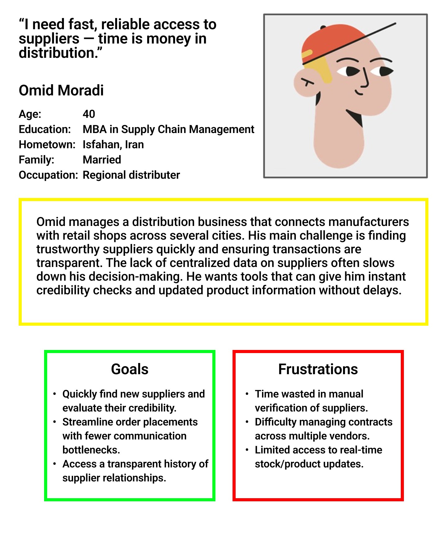
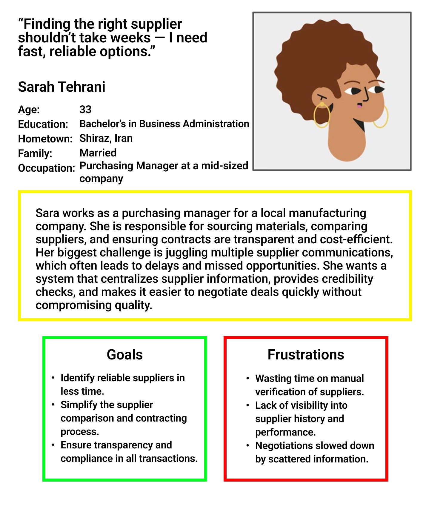
We identified three distinct user types representing the core of the Sanatnama value chain. Leila wants to be found. Omid wants to find quickly. Sarah wants to decide confidently.
image →
image →
image →
Competitive Landscape
Four competitors mapped across strengths, weaknesses, unique features, user sentiment, and market share. No one combined immersive 3D with a smooth, role-aware UX flow — that was the gap.
Point of View
How Might We
- HMWMake it instant for buyers to find the right industrial supplier — without prior knowledge of the ecosystem?
- HMWGive manufacturers tools to build credibility digitally — the way a physical stall builds trust face-to-face?
- HMWLet organizers see, in real time, the economic connections and activity happening inside the exhibition?
- HMWDesign onboarding that works for both a 25-year-old startup founder and a 55-year-old factory owner?
Ideate
Generating and stress-testing directions before committingFrom questions to concepts
A cross-functional workshop with developers, product owner, and marketing. SCAMPER to reframe existing industrial exhibition formats. Crazy 8s for eight distinct interface sketches per person in eight minutes — speed forces instinct over polish.
Role-First UX
Platform detects the user's role and surfaces contextual CTAs and templates. Reduces cognitive load by narrowing choices at entry.
3D-First Experience
The exhibition floor as the primary navigation metaphor. Users walk the space, enter stalls, discover products spatially in Unity.
Search-First Experience
Optimised B2B search with advanced filters as the main entry point — built for procurement professionals who know exactly what they need.
Hybrid Dashboard
Card-grid combining a 3D hall preview, smart filters, and quick analytics. Fast discovery and immersive exploration — serving all three personas without forcing one mental model.
The hybrid direction satisfied both speed (find the right supplier in under 15 minutes) and engagement (explore products in context). Role-first entry plus a hybrid dashboard without adding onboarding friction.
Key design trade-offs
Full 3D navigation is immersive but increases onboarding complexity and performance cost — especially on older devices in the target market.
Interactive 3D thumbnails as lightweight previews. Full 3D is opt-in with contextual onboarding that explains the interface before the user enters it.
Rich stall templates help build trust but increase setup friction for a manufacturer's first stall.
Templated stalls with sensible defaults, bulk upload, and inline guidance. Launch in under 20 minutes, refine progressively.
Prototype
From rough sketches to a testable high-fidelity systemPaper first, pixels second
Every key flow was sketched on paper before Figma was opened — forcing clarity about what actually needed to be on each screen. Three core flows: discovery and search, stall setup wizard, and 3D onboarding for first-time visitors. Each walked through with the development team before wireframing began.
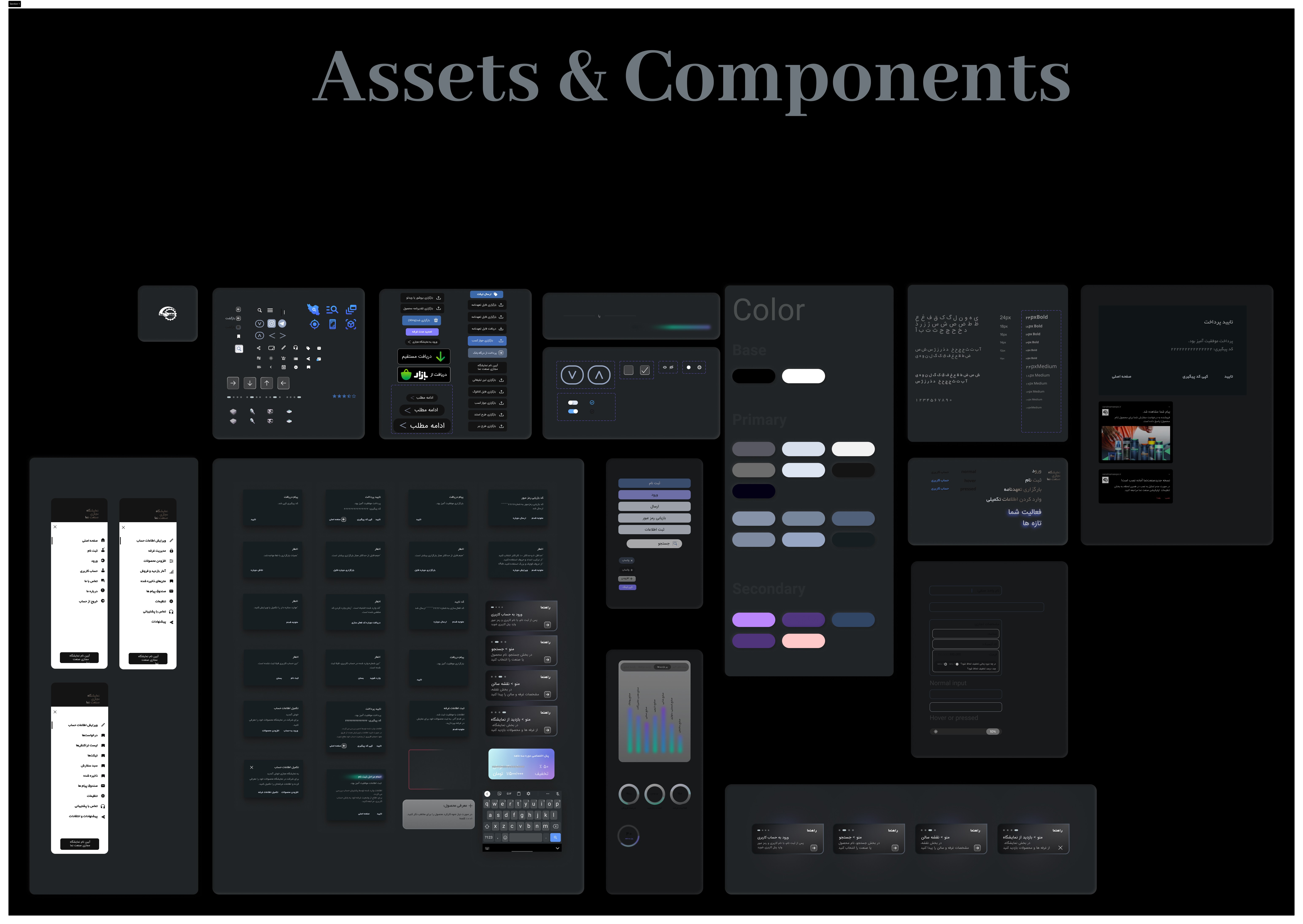
Design System
Built using Atomic Design before any hi-fi screens — ensuring consistency across a platform developed iteratively over multiple sprints.
Typography
IRANSans for Persian content, optimised for RTL readability. Clear hierarchy across 5 type scales with system fallbacks for Latin.
Colour
Deep navy primary (#141414 interface, #1B4FD8 action) with warm grey surface and soft blue accents — professional and modern, not playful.
Components
Stall cards, product tiles, search inputs, and verification badges componentised with variant states for rapid iteration during usability testing.
Layout
Adaptive grid for 1440px desktop primary (validated by research) with mobile-first responsive breakpoints for the app layer.
Final high-fidelity prototype
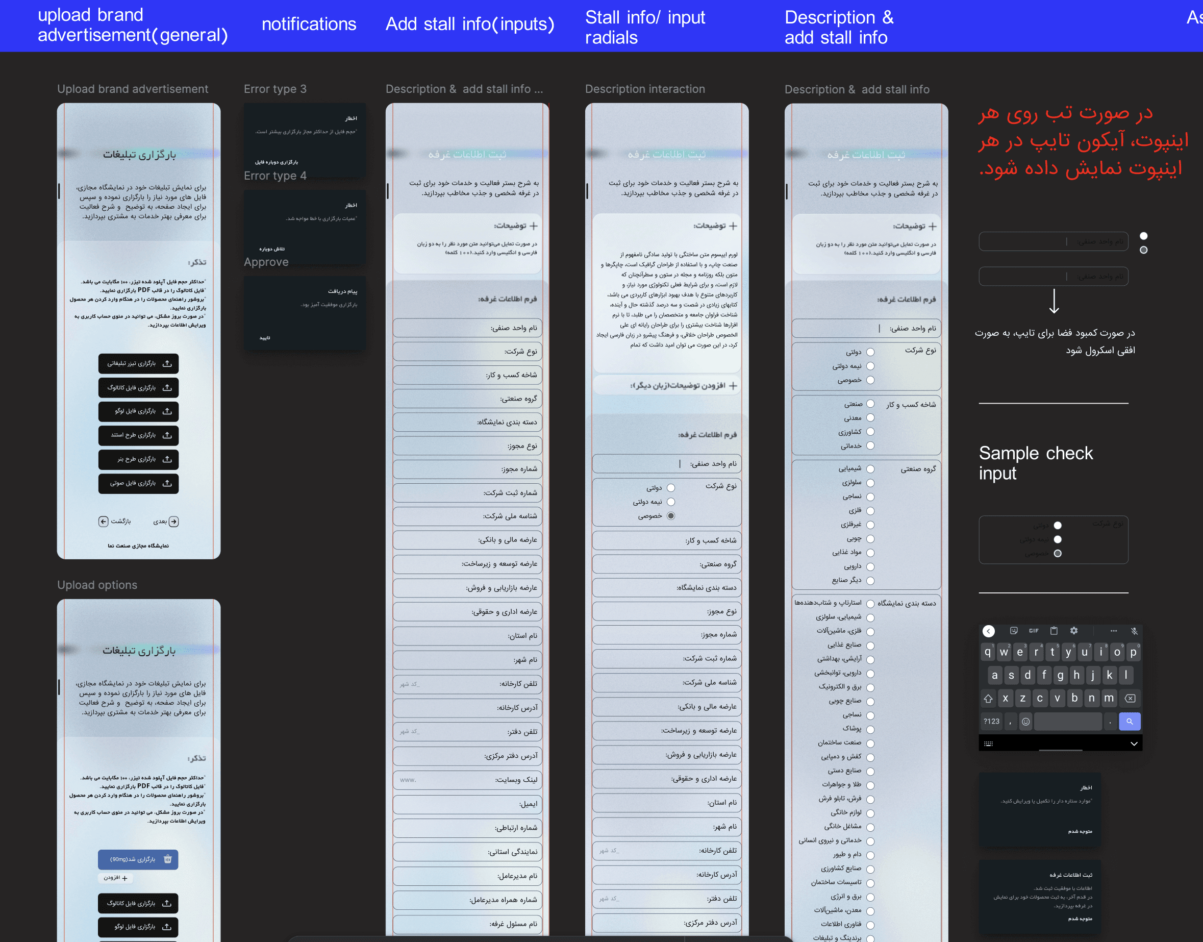
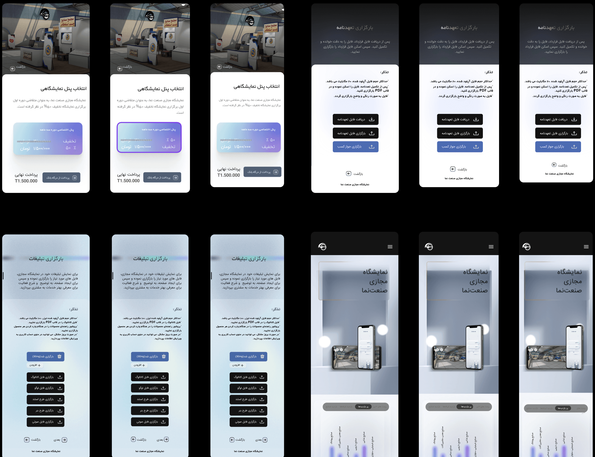
Sanatnama is a digital platform designed to connect industrial manufacturers with buyers, distributors, and procurement managers. The platform enables virtual 3D exhibition stalls, smart discovery, and online purchasing — backed by real-time analytics for organizers.
View Figma PrototypeTest
At scale — and with intentionUsability testing with 190 participants
Two modalities: moderated task-based sessions with 50 participants across flows, and unmoderated testing at scale through Maze with 140 additional participants. Tasks were structured around primary job-to-be-done scenarios — not feature exploration. Each round treated as a structured learning moment, not a validation exercise.
Key iterations
Unranked results, no contextual filtering. Average time-to-contact exceeded 25 minutes. Users browsed page after page without finding the right supplier.
Smart filters (industry, location, certification, size) with best-match ranking. Time-to-first-contact dropped below 12 minutes for the majority of sessions.
First-time users entered the 3D environment with no context. Most clicked randomly or exited immediately. Bounce exceeded 70%.
Contextual tooltip tour on first entry (once only). Explains navigation, hotspots, and stall interaction in 3 steps. 3D engagement increased 40%.
7-step checkout, no progress indicator. High abandonment mid-flow, particularly at the payment step.
Persistent progress bar, reduced to 4 steps, inline error recovery. Stall purchase completion improved 20% within the first month post-launch.
What this project taught me
This project sat at the intersection of service design, B2B product design, and emerging technology.
What I learned
Designing for a B2B ecosystem means designing multiple relationships simultaneously. Service blueprinting proved more useful than user flows alone.
What comes next
Expand the analytics dashboard — real-time connection mapping would significantly increase the platform's strategic value.
What I'd do differently
Run co-design sessions with manufacturing users earlier — particularly around stall setup, the source of most exhibitor drop-off.
Sanatnama
Industrial Vision
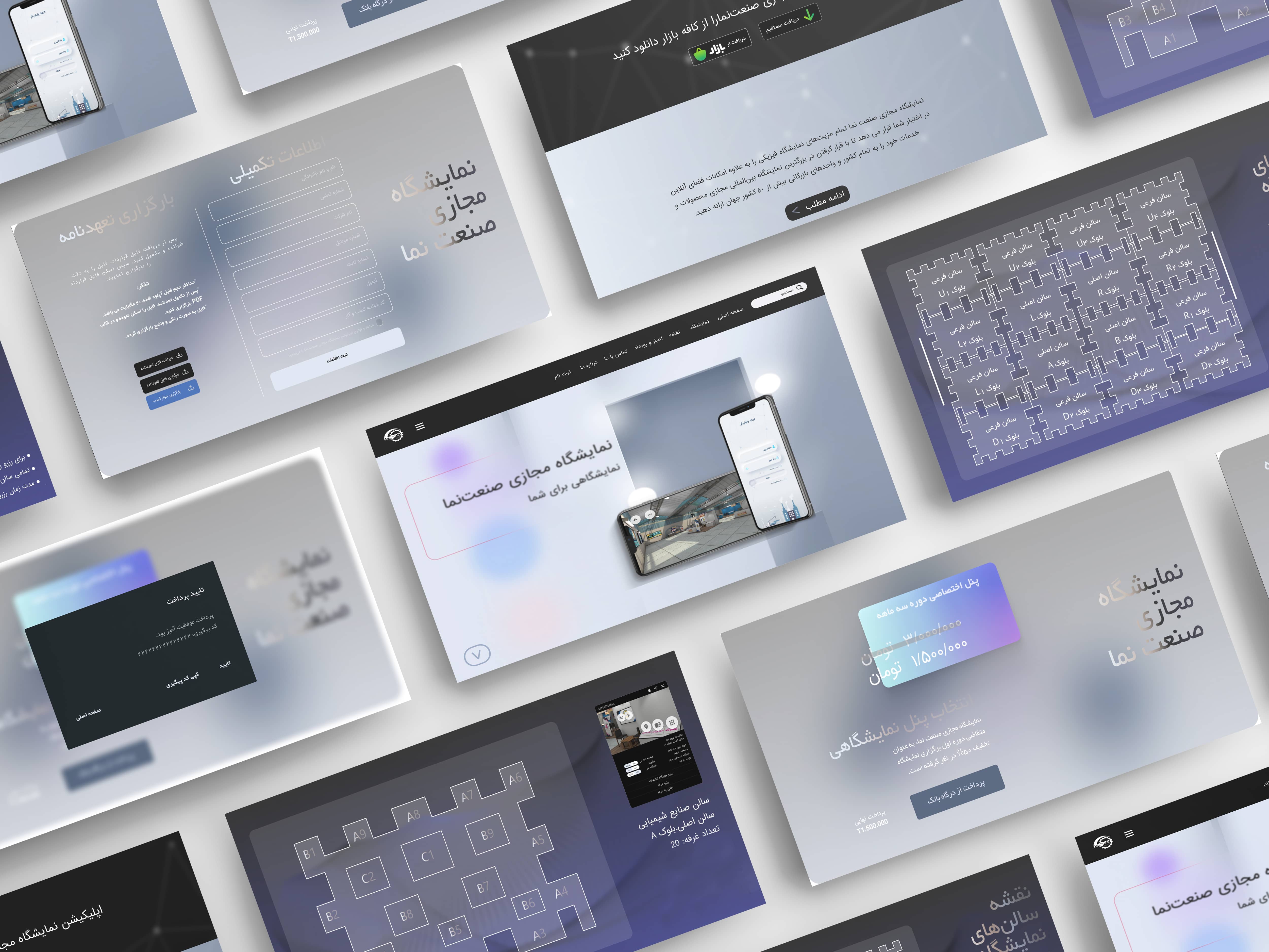
Invisible products. Fragmented connections.
Iran's industrial sector had a structural discovery problem. Manufacturers with quality products couldn't reach the right buyers. Procurement managers spent days manually verifying suppliers. Organizers had zero visibility into how value flowed across the ecosystem.
Physical exhibitions were expensive, time-bound, and geographically limited. What existed online was either outdated directories or generic B2B platforms with no industry context.
"Manufacturers with great products were invisible — buyers spent hours hunting suppliers, and organizers had no picture of who was connected to whom."
A sector failing to find itself
Manufacturers, suppliers, and distributors lacked a single trusted platform. Physical exhibitions were the primary touchpoint — costly, limited in reach, impossible to track. Procurement cycles dragged on for weeks due to unverified information and scattered communication.
Discover → Meet → Transact
Applying a hybrid Design Thinking and Service Design methodology, we built a desktop-first virtual exhibition that centralizes industrial profiles, enables 3D product stall exploration, and supports online purchasing — backed by real-time analytics.
Rather than a linear path, we moved fluidly between phases — testing assumptions, surfacing new constraints, refining solutions in tight iterative loops.
Empathize
Understanding the ecosystem before designing for itStarting with real people, not assumptions
All research was conducted in Persian with industrial professionals. Semi-structured interviews with 8 participants (ages 23–50), followed by an online survey reaching 35–40 additional respondents. Findings clustered using open affinity mapping in FigJam.
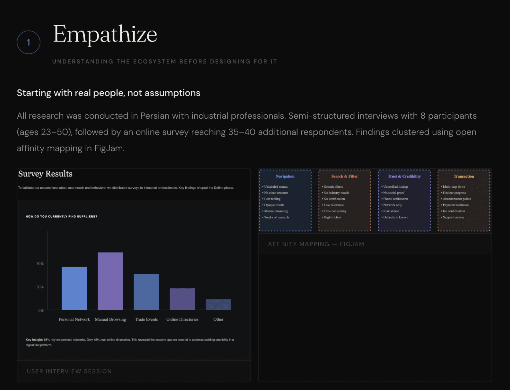
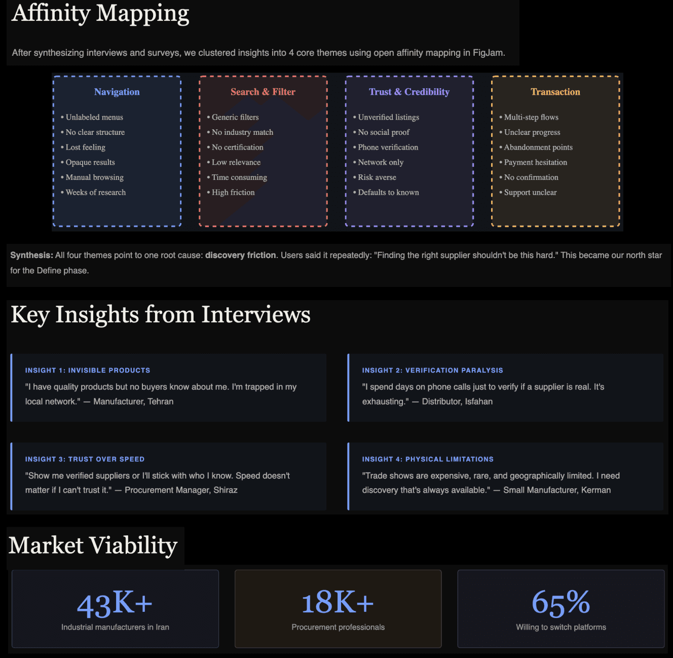
Four themes that anchored the design
Navigation Confusion
Users consistently felt lost. Menus were unlabeled, category structures opaque, and there was no clear mental model to anchor exploration.
Search & Filter Failure
Participants could rarely find specific suppliers. Filters were too generic — making procurement research a manual, time-consuming process.
Cluttered Interfaces
Existing platforms overwhelmed users with ads and competing hierarchies. Cognitive load during key tasks was far too high.
Checkout Complexity
Multi-step checkout flows with no progress indicators caused high abandonment. Users quit midway when unsure what came next.
One phrase came up again and again: users felt existing options required too much effort to find something that should be obvious. Discovery friction was the central, systemic problem — not any single feature.
Define
Crystallising who we're designing for — and why it matters to themThree archetypes. One ecosystem.
We identified three distinct user types representing the core of the Sanatnama value chain. Leila wants to be found. Omid wants to find quickly. Sarah wants to decide confidently.
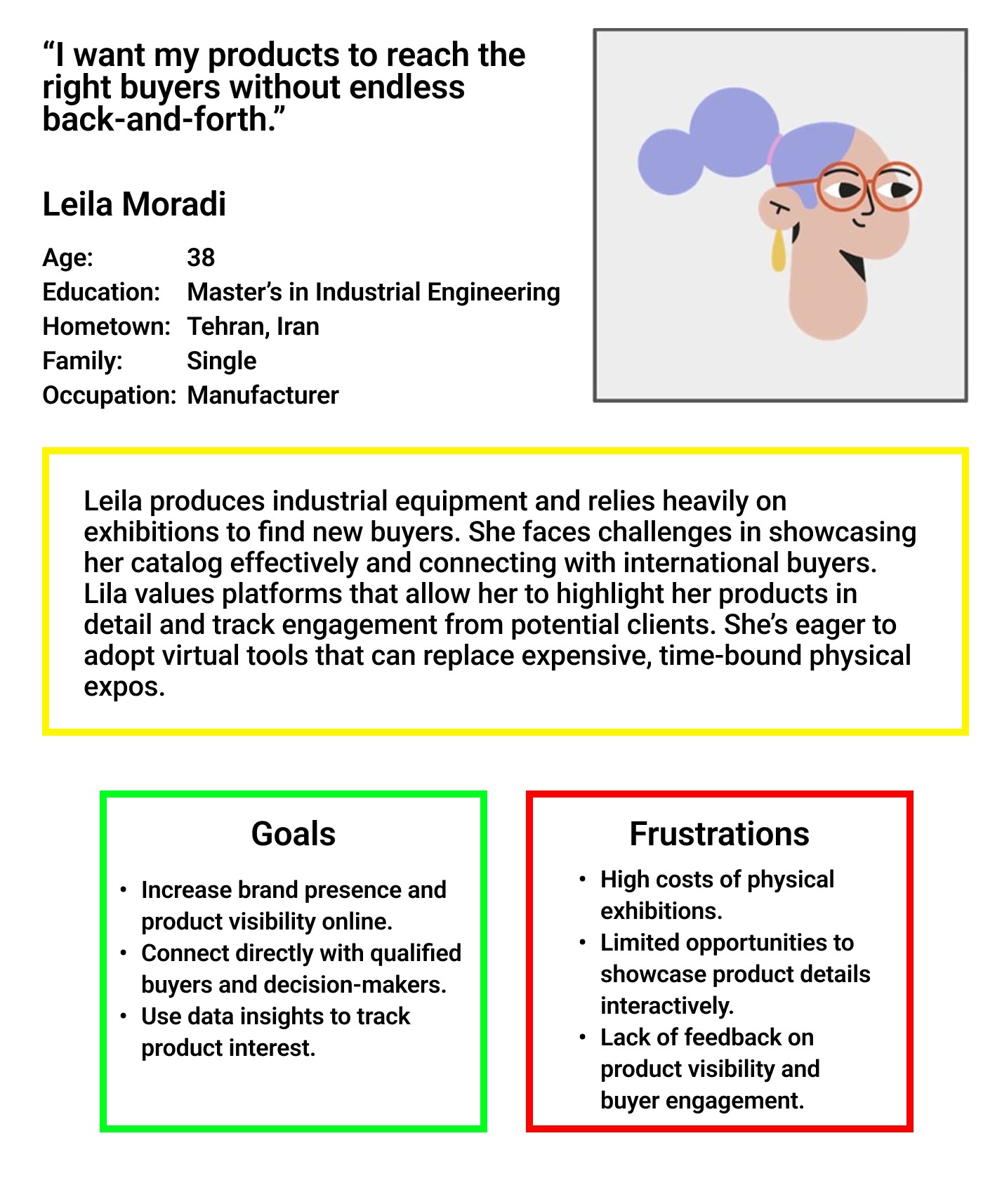
Competitive Landscape
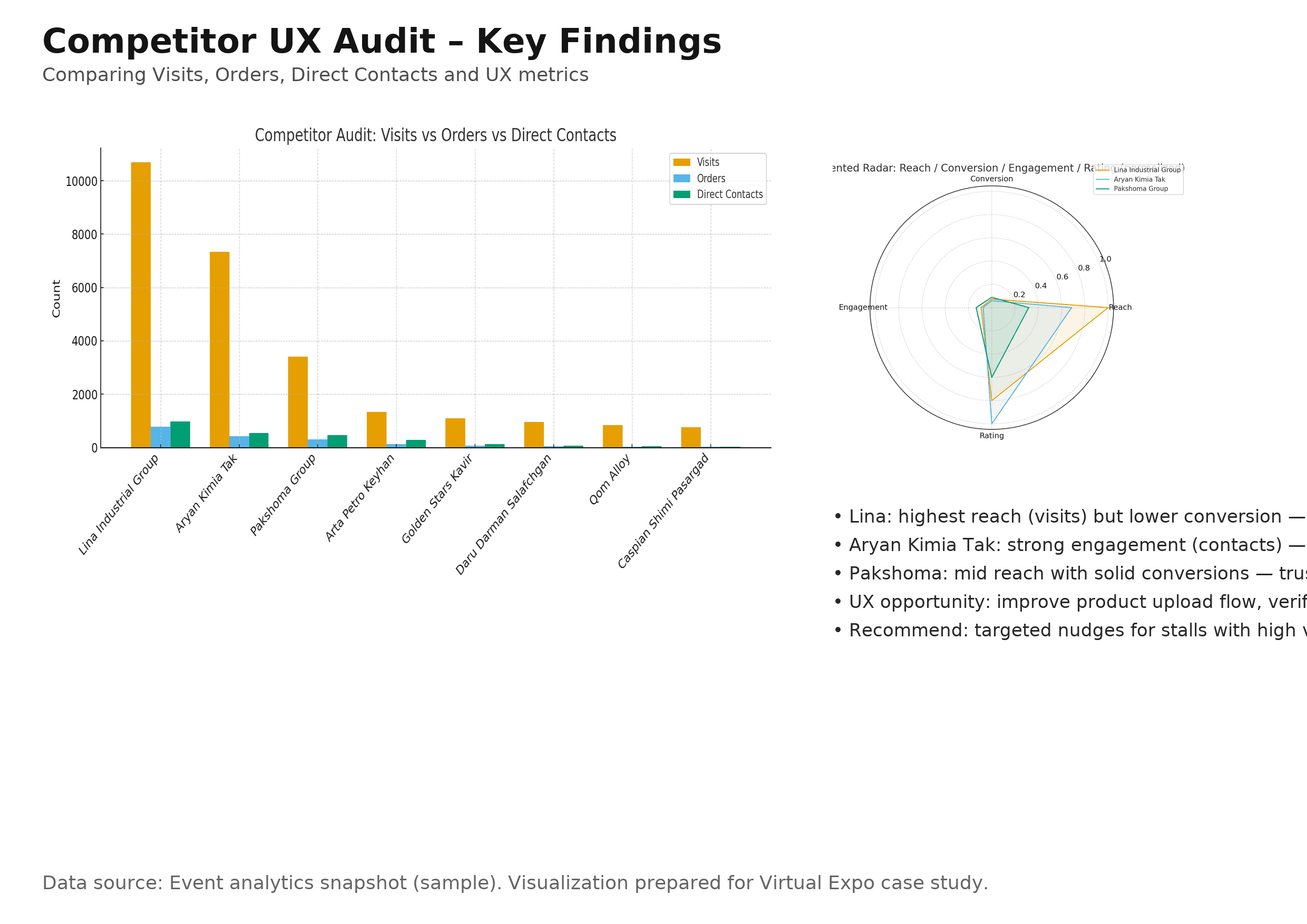
Four competitors mapped across strengths, weaknesses, unique features, user sentiment, and market share. No one combined immersive 3D with a smooth, role-aware UX flow — that was the gap.
Point of View
How Might We
- HMWMake it instant for buyers to find the right industrial supplier — without prior knowledge of the ecosystem?
- HMWGive manufacturers tools to build credibility digitally — the way a physical stall builds trust face-to-face?
- HMWLet organizers see, in real time, the economic connections and activity happening inside the exhibition?
- HMWDesign onboarding that works for both a 25-year-old startup founder and a 55-year-old factory owner?
Ideate
Generating and stress-testing directions before committingFrom questions to concepts
A cross-functional workshop with developers, product owner, and marketing. SCAMPER to reframe existing industrial exhibition formats. Crazy 8s for eight distinct interface sketches per person in eight minutes — speed forces instinct over polish.
Role-First UX
Platform detects the user's role and surfaces contextual CTAs and templates. Reduces cognitive load by narrowing choices at entry.
3D-First Experience
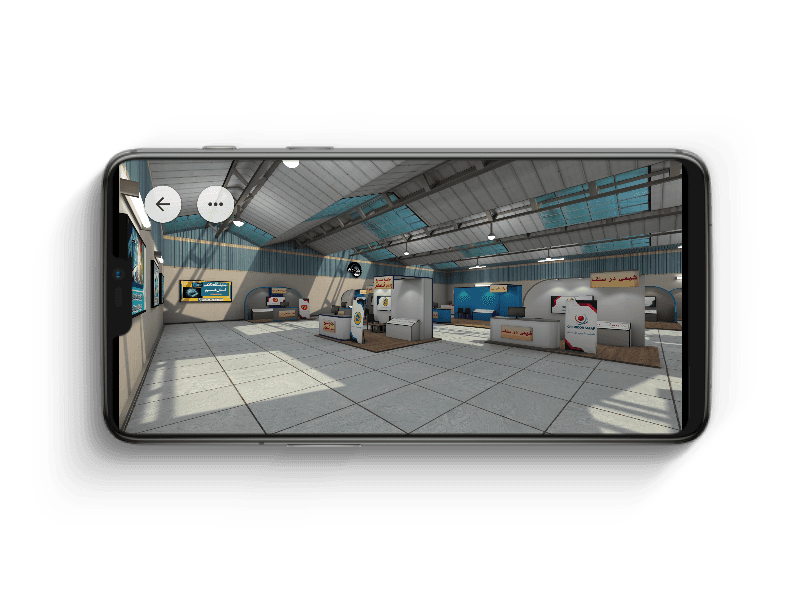
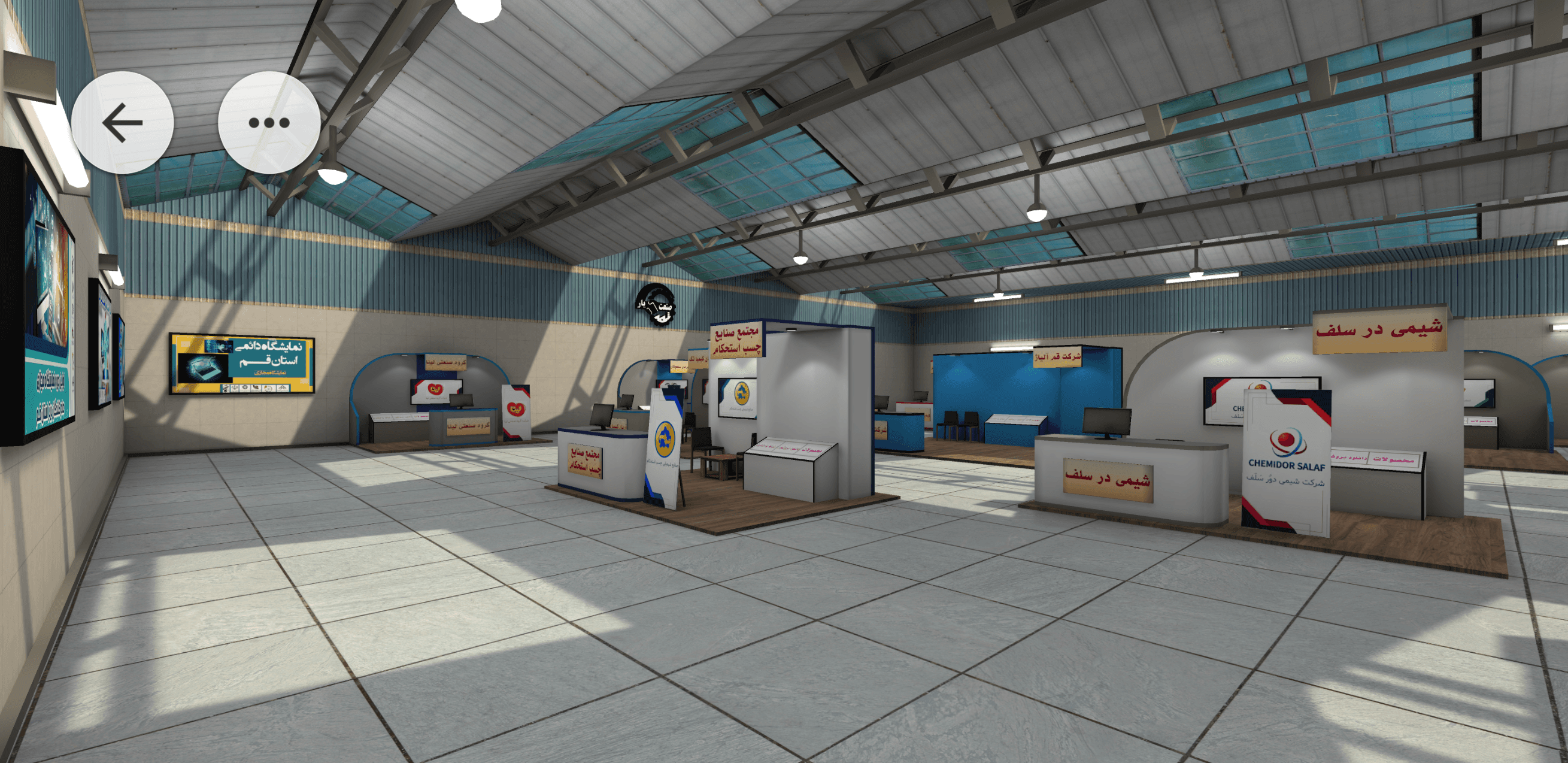
The exhibition floor as the primary navigation metaphor. Users walk the space, enter stalls, discover products spatially in Unity.
Search-First Experience
Optimised B2B search with advanced filters as the main entry point — built for procurement professionals who know exactly what they need.
Hybrid Dashboard
Card-grid combining a 3D hall preview, smart filters, and quick analytics. Fast discovery and immersive exploration — serving all three personas without forcing one mental model.
The hybrid direction satisfied both speed (find the right supplier in under 15 minutes) and engagement (explore products in context). Role-first entry plus a hybrid dashboard without adding onboarding friction.
Key design trade-offs
Full 3D navigation is immersive but increases onboarding complexity and performance cost — especially on older devices in the target market.
Interactive 3D thumbnails as lightweight previews. Full 3D is opt-in with contextual onboarding that explains the interface before the user enters it.
Rich stall templates help build trust but increase setup friction for a manufacturer's first stall.
Templated stalls with sensible defaults, bulk upload, and inline guidance. Launch in under 20 minutes, refine progressively.
Prototype
From rough sketches to a testable high-fidelity systemPaper first, pixels second
Every key flow was sketched on paper before Figma was opened — forcing clarity about what actually needed to be on each screen. Three core flows: discovery and search, stall setup wizard, and 3D onboarding for first-time visitors. Each walked through with the development team before wireframing began.
Design System
Built using Atomic Design before any hi-fi screens — ensuring consistency across a platform developed iteratively over multiple sprints.
Typography
IRANSans for Persian content, optimised for RTL readability. Clear hierarchy across 5 type scales with system fallbacks for Latin.
Colour
Deep navy primary (#141414 interface, #1B4FD8 action) with warm grey surface and soft blue accents — professional and modern, not playful.
Components
Stall cards, product tiles, search inputs, and verification badges componentised with variant states for rapid iteration during usability testing.
Layout
Adaptive grid for 1440px desktop primary (validated by research) with mobile-first responsive breakpoints for the app layer.
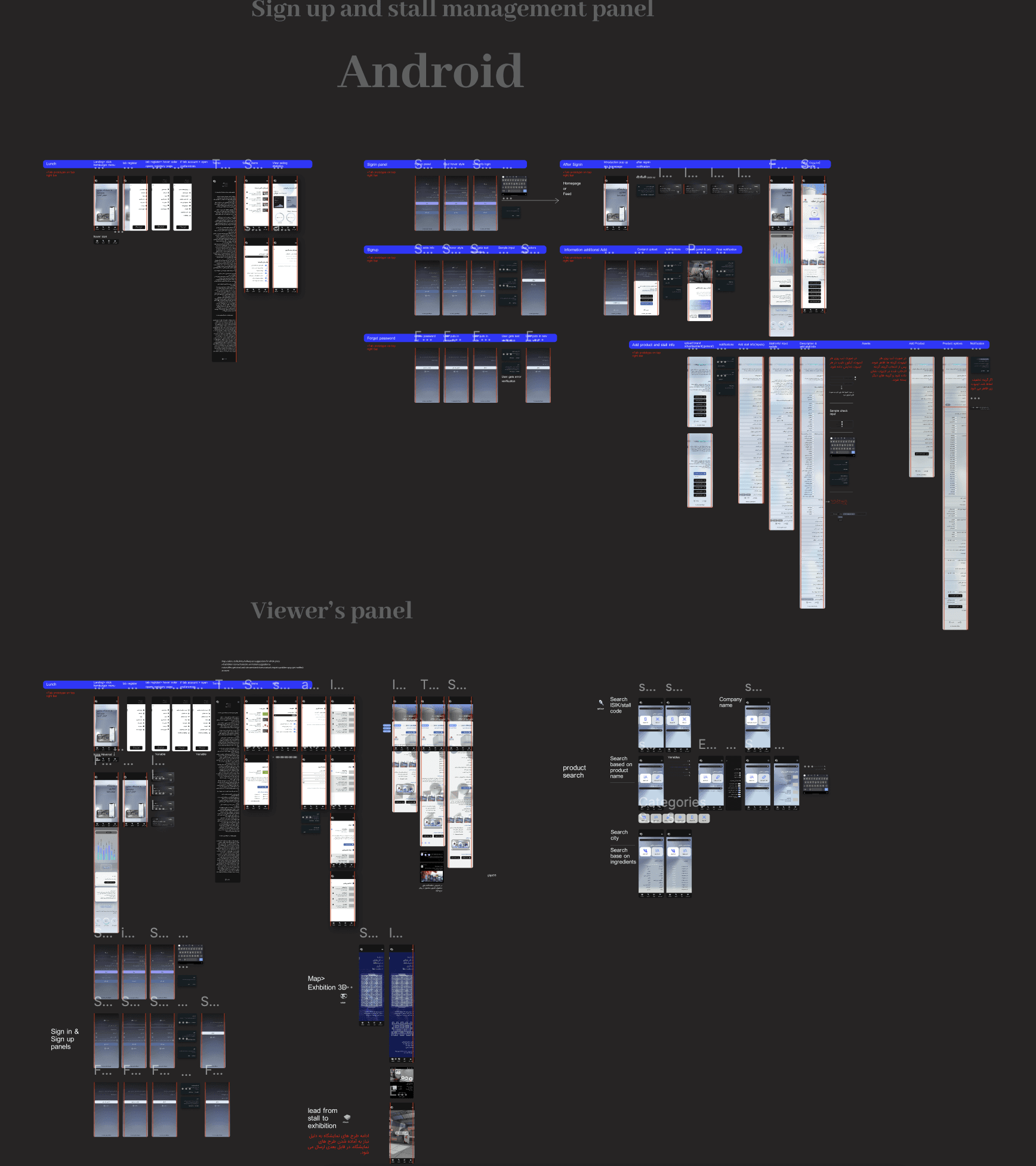
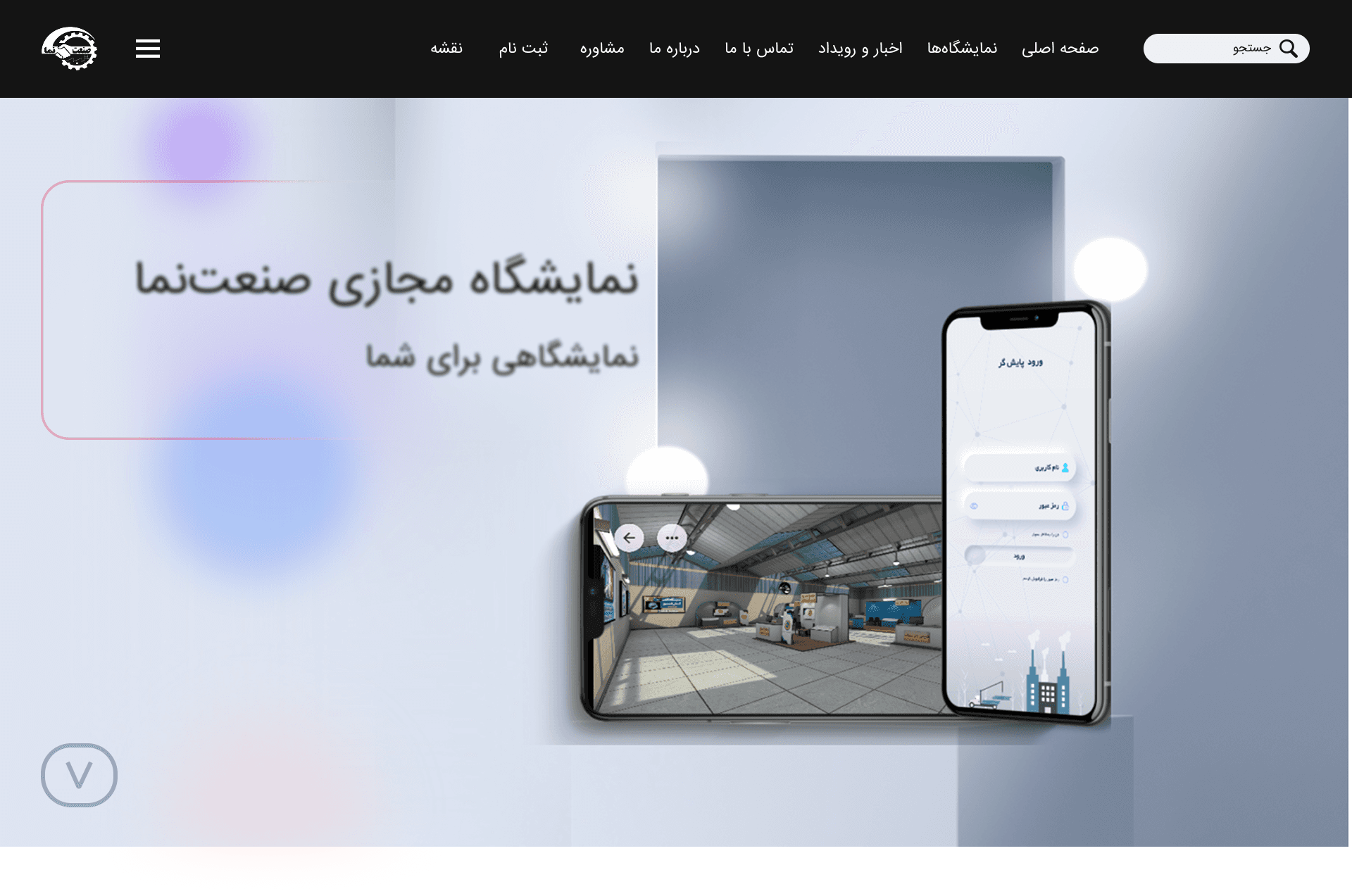
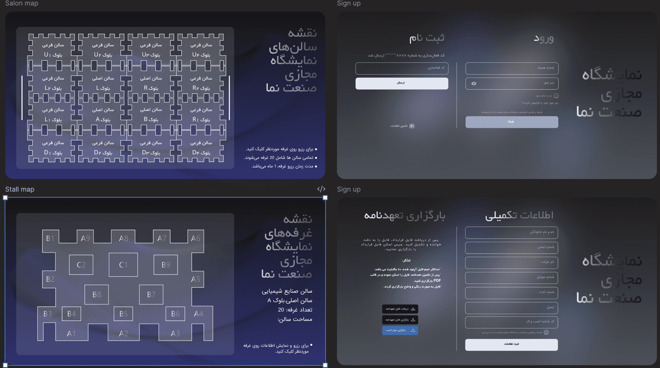
Final high-fidelity prototype
Sanatnama is a digital platform designed to connect industrial manufacturers with buyers, distributors, and procurement managers. The platform enables virtual 3D exhibition stalls, smart discovery, and online purchasing — backed by real-time analytics for organizers.
View Figma Prototype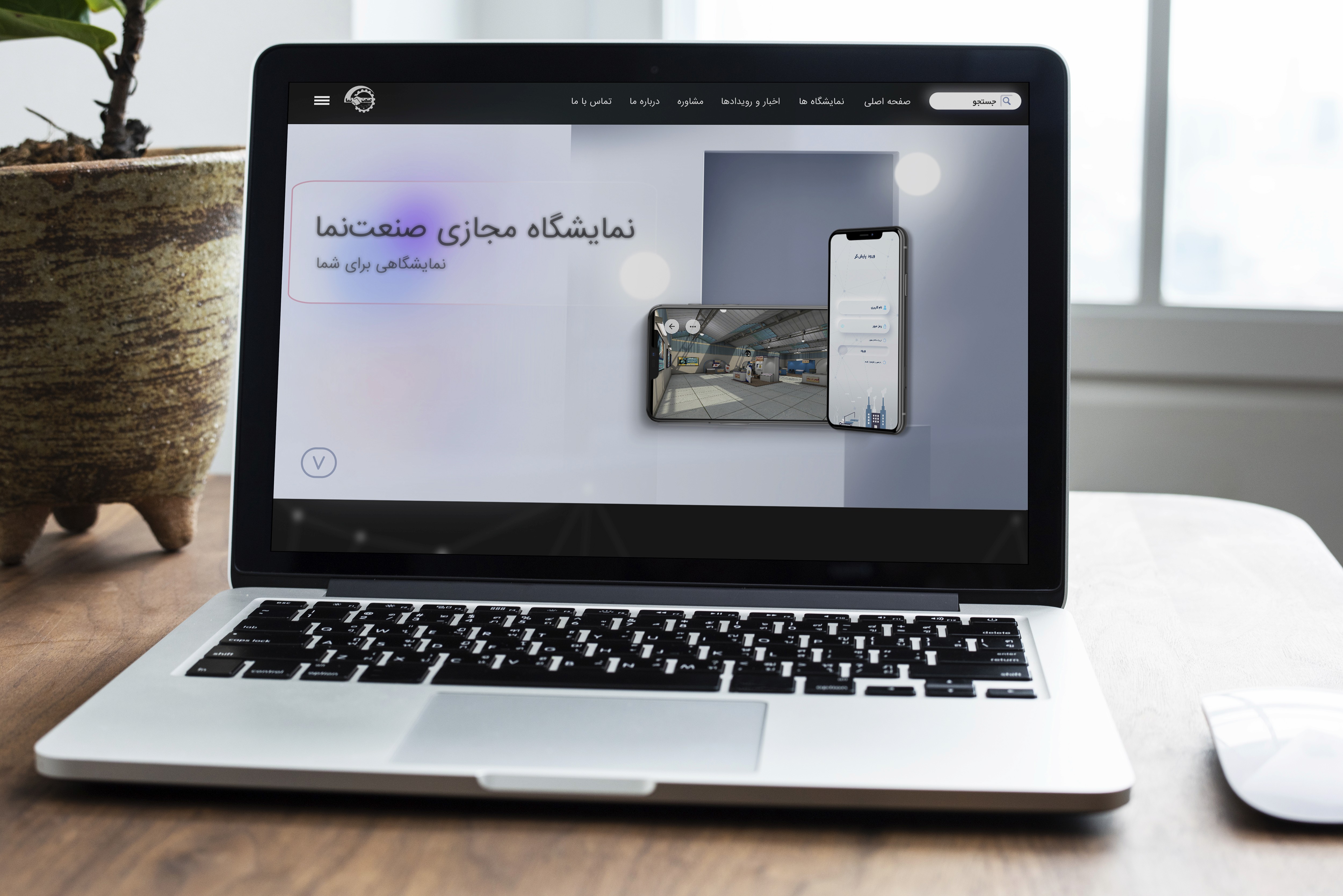
Test
At scale — and with intentionUsability testing with 190 participants
Two modalities: moderated task-based sessions with 50 participants across flows, and unmoderated testing at scale through Maze with 140 additional participants. Tasks were structured around primary job-to-be-done scenarios — not feature exploration. Each round treated as a structured learning moment, not a validation exercise.
Key iterations
Unranked results, no contextual filtering. Average time-to-contact exceeded 25 minutes. Users browsed page after page without finding the right supplier.
Smart filters (industry, location, certification, size) with best-match ranking. Time-to-first-contact dropped below 12 minutes for the majority of sessions.
First-time users entered the 3D environment with no context. Most clicked randomly or exited immediately. Bounce exceeded 70%.
Contextual tooltip tour on first entry (once only). Explains navigation, hotspots, and stall interaction in 3 steps. 3D engagement increased 40%.
7-step checkout, no progress indicator. High abandonment mid-flow, particularly at the payment step.
Persistent progress bar, reduced to 4 steps, inline error recovery. Stall purchase completion improved 20% within the first month post-launch.
What this project taught me
This project sat at the intersection of service design, B2B product design, and emerging technology.
What I learned
Designing for a B2B ecosystem means designing multiple relationships simultaneously. Service blueprinting proved more useful than user flows alone.
What comes next
Expand the analytics dashboard — real-time connection mapping would significantly increase the platform's strategic value.
What I'd do differently
Run co-design sessions with manufacturing users earlier — particularly around stall setup, the source of most exhibitor drop-off.
My Viking
Redesigning a telecom's only storefront — with AI at the center
No physical store. No UX foundation. One app holding the whole relationship.
Mobile Vikings is a Belgian telecom and internet provider that runs almost entirely online — there are no physical stores, so the app is the relationship with the customer. I joined first as a UX intern and then part-time alongside it, which meant I saw the operational workflows, the support load, and the business constraints firsthand.
The redesign of the My Viking app became the most complete product experience in my portfolio — one where AI sat at the center of both what I designed and how I built it.
"A designer's job isn't to hand over beautiful screens — it's to clarify and defend the process. If you can't explain why research comes before a design system, the team won't follow the structure."
Fragmented app, conflicting audiences, zero UX practice
The app had grown fragmented over years, but the deeper problem was structural: there was no UX foundation in the company at all — no personas, no research practice. And the user base wasn't one audience: a prepaid user, a streaming household, and a multi-product family all wanted different things, and nobody had defined who they were.
Research-led structure, a control-hub Home, and AI self-service
A user-centered redesign built from scratch: the company's first personas and segmentation, a five-tab structure with Home as a control hub of cross-app shortcuts, and an AI-powered self-care layer designed to deflect repetitive support before a ticket is ever created.
An end-to-end user-centered process — built from scratch, accelerated with AI, and run in weekly OKR cycles with stakeholders across product, marketing, content, and engineering.
Building a research foundation from zero
No UX existed — so I started there
Since there was no research practice in the company, I ran the discovery myself. I pulled together every available signal — existing surveys and interviews, app-store reviews, support tickets, internal analytics, stakeholder and marketing input, and competitor benchmarking — and structured the loose continuous-discovery notes the team already kept into something usable.
To handle the volume, I used NotebookLM to synthesize the research — clustering interview notes, survey responses, and recurring ticket themes into patterns far faster than by hand.
What the research revealed
A fragmented experience
The app had grown cluttered and inconsistent over years without a major update — routine tasks felt heavier than they should.
Conflicting audiences
Prepaid, subscription, streaming, and multi-product family users all wanted different things — and none of them were defined.
Repetitive support load
Live chat, calls, and Zendesk tickets carried real cost — mostly the same SIM, eSIM, and billing questions over and over.
Untapped loyalty
Partner deals and points were a real retention lever, but buried — value the app wasn't showing its customers.
The signal was clear: the segments' priorities differed, but they overlapped. The opportunity was to find the shared, high-priority needs and surface them consistently — for everyone.
The company's first personas — and the common spine
Segmentation, built from scratch
From the synthesized research I built the company's first personas and user segmentation — distinct customer types, each with their own goals and frustrations. They became the language the team used to make decisions: when we argued about a layout, we argued through the personas, not opinions.
I then mapped how each segment moved through the product — journey maps and service mapping linking front-stage user actions to the back-stage systems and support touchpoints behind them, surfacing where the experience broke down.
Point of view
How might we
- HMWGive combo users one dashboard that shows mobile and home-internet usage at a glance?
- HMWMake Viking Deals clear and prominent, so customers understand and act on the offer?
- HMWSimplify the top-up process so users can check and top up data quickly?
- HMWMake support easy to access, with AI-guided answers for common questions?
One spine, five tabs, an AI front door
A control-hub structure
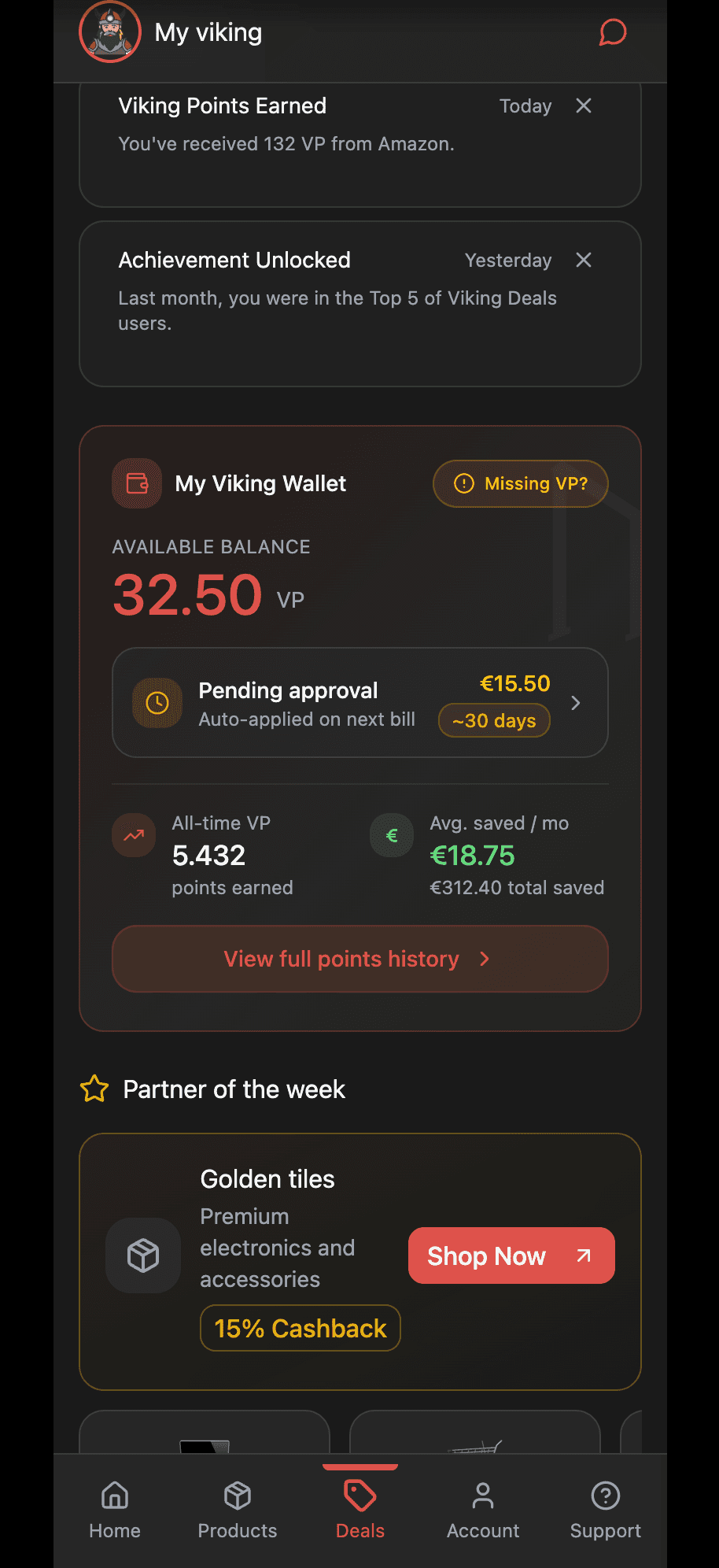
Rather than design five disconnected experiences, I built the IA around the shared, high-priority needs — so the same core actions lived in predictable places for everyone. I reduced a sprawling structure to five core tabs and designed the Home tab as a control hub: a single place pulling the most important widget from every other tab — usage overview, a quick top-up or pay-invoice action, the Viking Wallet, campaigns, and self-care tips — each a shortcut into its parent tab.
★ The headline idea: make AI the front door to support. Most ticket volume was repetitive — the same SIM, eSIM, and billing questions. Guided self-service could deflect it before a ticket is ever created.
Designing the AI self-care layer
Instead of just redesigning the contact form, I designed an AI-powered self-care search as the entry to support. Search "SIM card" and it surfaces the relevant journeys — activate a SIM, set up or transfer an eSIM, troubleshoot — and walks the user through them inline. Paired with predictive notifications (accurate delivery and timing expectations), the goal was to remove repetitive tickets at the source.
The hard part wasn't the search box — it was the system around it: defining notification priority, category, and form (in-app, pop-up, banner) and the order information should appear in, so the AI layer reduced confusion instead of adding noise. That's where service design and AI met: designing the logic, not just the interface.
Designing within real constraints
Some ideas were user-friendly in concept but hard to build on the current backend — and the domain was genuinely complex: roaming governance, billing cycles, usage tracking.
I pulled developers in early, learned the domain, and decided what not to show — e.g. payment history, which analytics showed almost nobody used — designing with implementation in mind.
A documented system, built AI-fast
One system, not a pile of screens
I designed the app as a single system on Mobile Vikings' brand style guide. Components were built with states and variants — so one usage card could express healthy, critical, or depleted data, or a plan tier, from one source of truth. Across the tabs, the same patterns repeat, so it feels like one product.
Home control hub
Usage overview, quick top-up / pay-invoice, Wallet, and campaigns — shortcuts into every tab.
Household management
Permission-based multi-user control: view-only vs. full access, so a parent can oversee a child's plan safely.
Loyalty as the surface
Viking Wallet, partner deals (shop-and-earn), and auto-applied combo benefits framed as visible value.
AI self-care + support
AI search, guided journeys, self-care articles, and order/incident notifications in one tab.
Documented to outlast me
Because I was laying the company's first UX foundation, documentation was a deliverable. I wrote UX documentation in Confluence — component behavior, notification logic, validations, and the rationale behind decisions — so the design could survive past my internship and give developers an unambiguous reference at handoff.
★ The AI-assisted workflow
Just as AI shaped the product, it reshaped how I worked — I built the redesign with an AI-accelerated toolchain rather than the slow way:
Figma Make
Generated layout and component-state starting points from prompts, then refined with design judgment.
NotebookLM
Synthesized research and surfaced themes across interviews, surveys, and support tickets.
Claude + Cursor
Drove the design-and-build workflow, including prototyping the experience as real, navigable code.
Make
Automations that removed repetitive manual steps from the process.
AI didn't replace the design work — it compressed the routine parts so I could spend more time on prioritization, systems logic, and the why. Knowing when to trust an AI output and when to override it became its own skill.
Interactive prototype, built as real code
Using Claude and Cursor, I prototyped the experience as a live, navigable build — the control-hub Home, AI self-care search, Deals, and account management — not just clickable frames.
↗ View the live prototypeValidating, in tight cross-functional loops
Usability & A/B testing
The redesign was evaluated through usability testing with colleagues and stakeholders, A/B testing discussions, and iterative rounds on low-fidelity prototypes before higher-fidelity exploration. Feedback was folded continuously into both the UX structure and component-level decisions — testing treated as a learning loop, not a final sign-off.
Running on OKRs, Jira & Slack
The project ran on weekly OKRs and tight feedback loops with a cross-functional group — product stakeholders, marketing, content, developers, and the UI/design-system team. Work was scoped and tracked as Jira tickets across sprints, while Slack channels and threads were where issues got raised, decisions discussed, and meetings spun up. Designing for feasibility meant pulling developers in early so the design could actually be built.
What this project taught me
This internship bridged academic study and professional practice. As both designer and prototype developer, I learned to apply user-centered methods under real constraints — and that a designer's responsibility is to clarify and defend the process itself.
What I learned
If a designer can't explain why research and prioritization come before a design system, the team won't follow the structure. Communication is the work.
AI as a force multiplier
Used well, AI compressed the routine work and freed me to focus on prioritization, systems logic, and judgment — while I stayed responsible for the why.
What I'd do differently
Share work in progress sooner instead of polishing in private — it sped up iteration and improved the final outcome.
My Viking
Redesigning a telecom's only storefront — with AI at the center
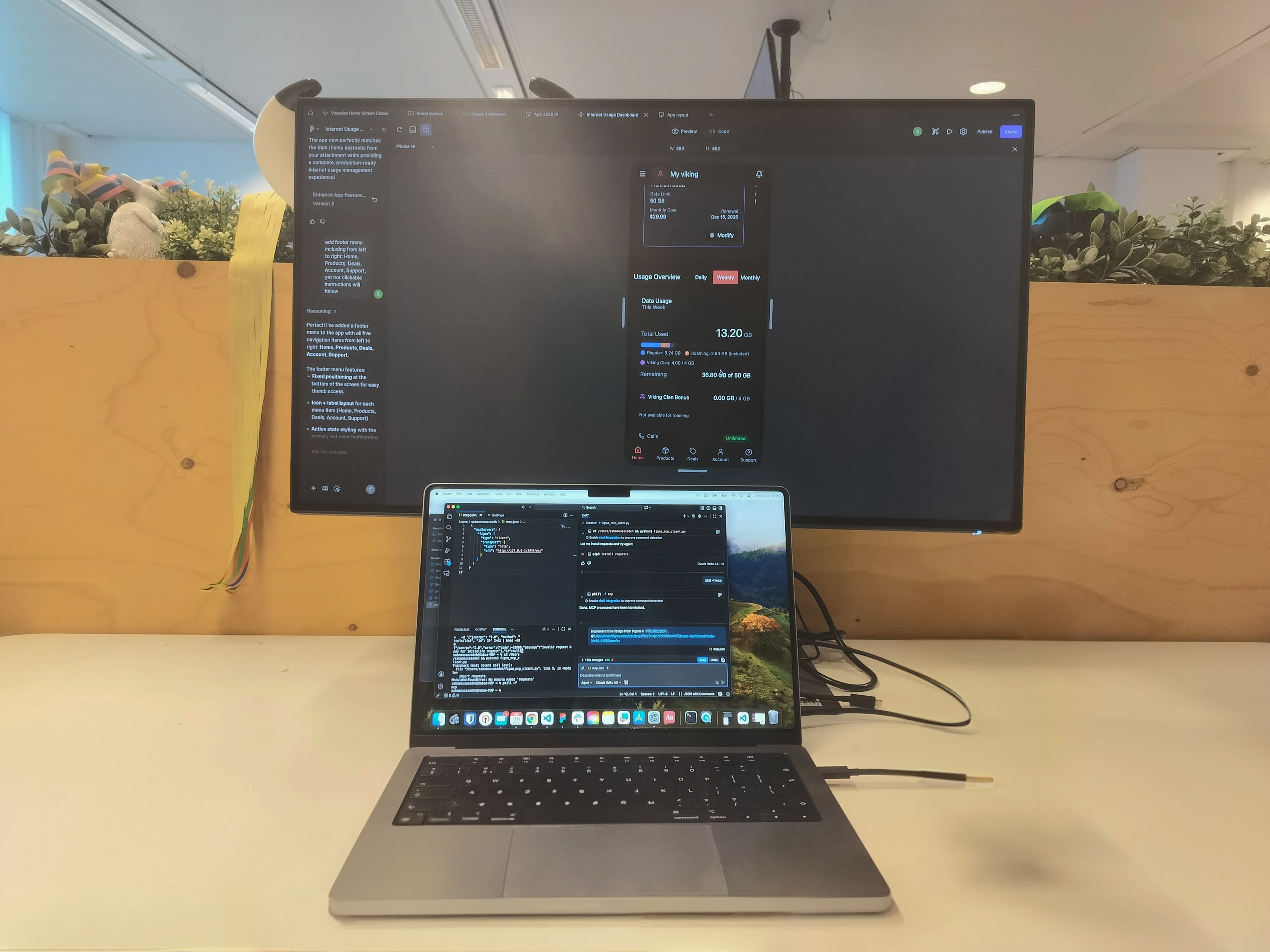
No physical store. No UX foundation. One app holding the whole relationship.
Mobile Vikings is a Belgian telecom and internet provider that runs almost entirely online — there are no physical stores, so the app is the relationship with the customer. I joined first as a UX intern and then part-time alongside it, which meant I saw the operational workflows, the support load, and the business constraints firsthand.
The redesign of the My Viking app became the most complete product experience in my portfolio — one where AI sat at the center of both what I designed and how I built it.
"A designer's job isn't to hand over beautiful screens — it's to clarify and defend the process. If you can't explain why research comes before a design system, the team won't follow the structure."
Fragmented app, conflicting audiences, zero UX practice
The app had grown fragmented over years, but the deeper problem was structural: there was no UX foundation in the company at all — no personas, no research practice. And the user base wasn't one audience: a prepaid user, a streaming household, and a multi-product family all wanted different things, and nobody had defined who they were.
Research-led structure, a control-hub Home, and AI self-service
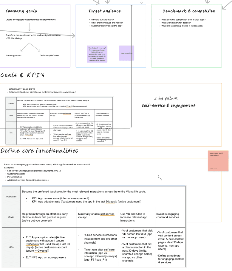
A user-centered redesign built from scratch: the company's first personas and segmentation, a five-tab structure with Home as a control hub of cross-app shortcuts, and an AI-powered self-care layer designed to deflect repetitive support before a ticket is ever created.
An end-to-end user-centered process — built from scratch, accelerated with AI, and run in weekly OKR cycles with stakeholders across product, marketing, content, and engineering.
Building a research foundation from zero
No UX existed — so I started there
Since there was no research practice in the company, I ran the discovery myself. I pulled together every available signal — existing surveys and interviews, app-store reviews, support tickets, internal analytics, stakeholder and marketing input, and competitor benchmarking — and structured the loose continuous-discovery notes the team already kept into something usable.
To handle the volume, I used NotebookLM to synthesize the research — clustering interview notes, survey responses, and recurring ticket themes into patterns far faster than by hand.


What the research revealed
A fragmented experience
The app had grown cluttered and inconsistent over years without a major update — routine tasks felt heavier than they should.
Conflicting audiences
Prepaid, subscription, streaming, and multi-product family users all wanted different things — and none of them were defined.
Repetitive support load
Live chat, calls, and Zendesk tickets carried real cost — mostly the same SIM, eSIM, and billing questions over and over.
Untapped loyalty
Partner deals and points were a real retention lever, but buried — value the app wasn't showing its customers.
The signal was clear: the segments' priorities differed, but they overlapped. The opportunity was to find the shared, high-priority needs and surface them consistently — for everyone.

The company's first personas — and the common spine
Segmentation, built from scratch
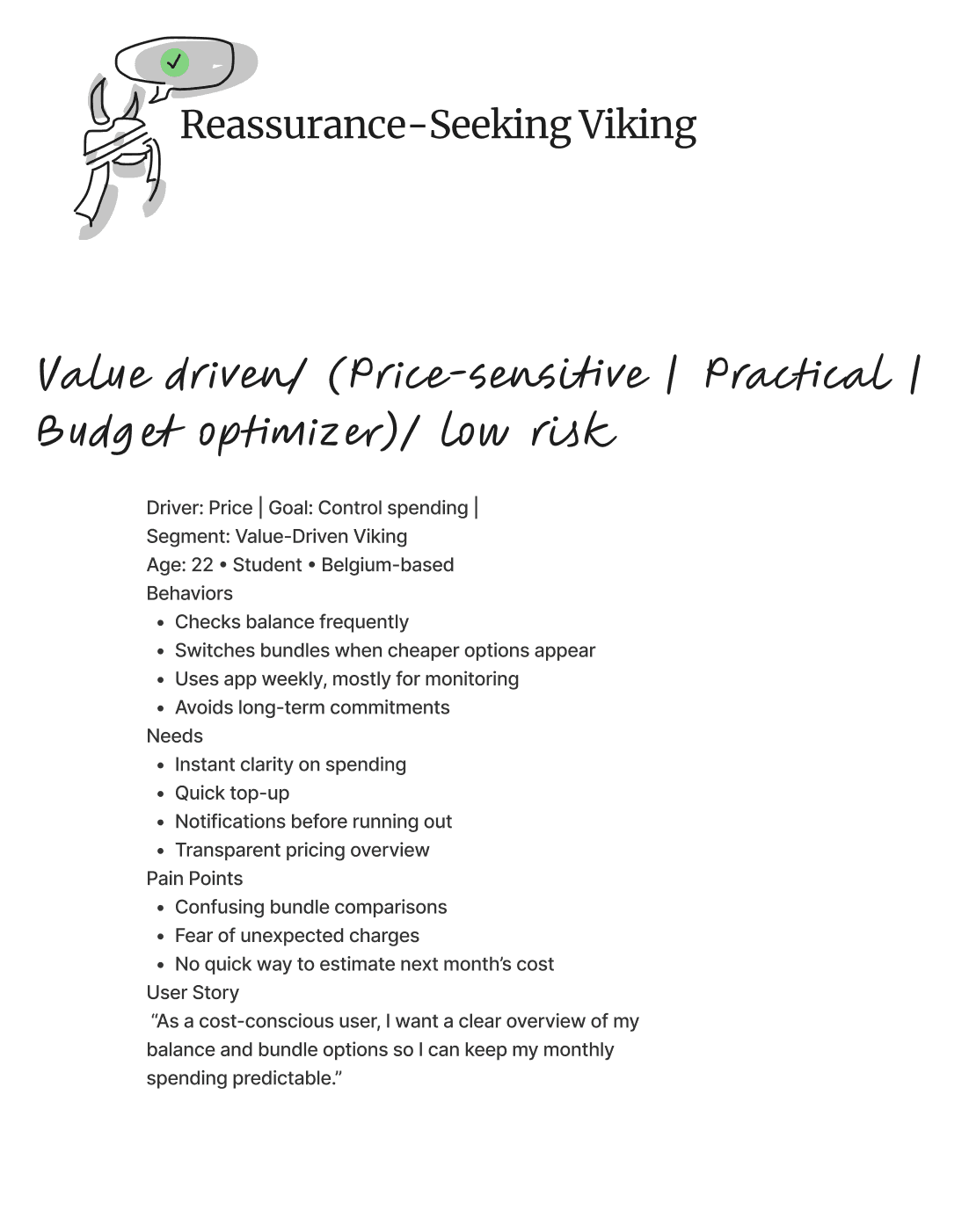
From the synthesized research I built the company's first personas and user segmentation — distinct customer types, each with their own goals and frustrations. They became the language the team used to make decisions: when we argued about a layout, we argued through the personas, not opinions.
I then mapped how each segment moved through the product — journey maps and service mapping linking front-stage user actions to the back-stage systems and support touchpoints behind them, surfacing where the experience broke down.



Point of view
How might we
- HMWGive combo users one dashboard that shows mobile and home-internet usage at a glance?
- HMWMake Viking Deals clear and prominent, so customers understand and act on the offer?
- HMWSimplify the top-up process so users can check and top up data quickly?
- HMWMake support easy to access, with AI-guided answers for common questions?

One spine, five tabs, an AI front door
A control-hub structure
Rather than design five disconnected experiences, I built the IA around the shared, high-priority needs — so the same core actions lived in predictable places for everyone. I reduced a sprawling structure to five core tabs and designed the Home tab as a control hub: a single place pulling the most important widget from every other tab — usage overview, a quick top-up or pay-invoice action, the Viking Wallet, campaigns, and self-care tips — each a shortcut into its parent tab.

★ The headline idea: make AI the front door to support. Most ticket volume was repetitive — the same SIM, eSIM, and billing questions. Guided self-service could deflect it before a ticket is ever created.
Designing the AI self-care layer
Instead of just redesigning the contact form, I designed an AI-powered self-care search as the entry to support. Search "SIM card" and it surfaces the relevant journeys — activate a SIM, set up or transfer an eSIM, troubleshoot — and walks the user through them inline. Paired with predictive notifications (accurate delivery and timing expectations), the goal was to remove repetitive tickets at the source.
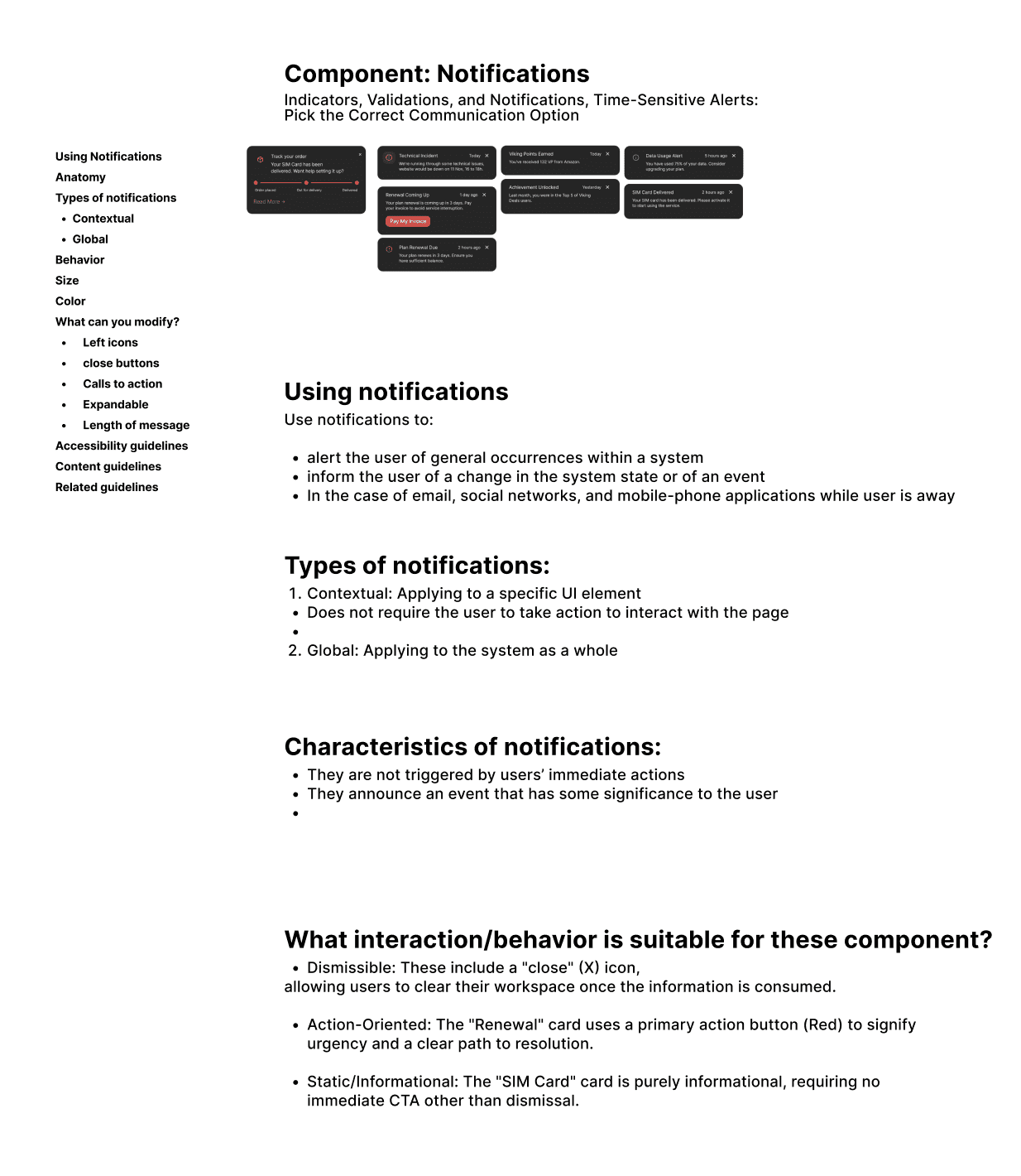
The hard part wasn't the search box — it was the system around it: defining notification priority, category, and form (in-app, pop-up, banner) and the order information should appear in, so the AI layer reduced confusion instead of adding noise. That's where service design and AI met: designing the logic, not just the interface.

Designing within real constraints
Some ideas were user-friendly in concept but hard to build on the current backend — and the domain was genuinely complex: roaming governance, billing cycles, usage tracking.
I pulled developers in early, learned the domain, and decided what not to show — e.g. payment history, which analytics showed almost nobody used — designing with implementation in mind.
A documented system, built AI-fast
One system, not a pile of screens
I designed the app as a single system on Mobile Vikings' brand style guide. Components were built with states and variants — so one usage card could express healthy, critical, or depleted data, or a plan tier, from one source of truth. Across the tabs, the same patterns repeat, so it feels like one product.
Home control hub
Usage overview, quick top-up / pay-invoice, Wallet, and campaigns — shortcuts into every tab.
Household management
Permission-based multi-user control: view-only vs. full access, so a parent can oversee a child's plan safely.
Loyalty as the surface
Viking Wallet, partner deals (shop-and-earn), and auto-applied combo benefits framed as visible value.
AI self-care + support
AI search, guided journeys, self-care articles, and order/incident notifications in one tab.
Documented to outlast me
Because I was laying the company's first UX foundation, documentation was a deliverable. I wrote UX documentation in Confluence — component behavior, notification logic, validations, and the rationale behind decisions — so the design could survive past my internship and give developers an unambiguous reference at handoff.


★ The AI-assisted workflow
Just as AI shaped the product, it reshaped how I worked — I built the redesign with an AI-accelerated toolchain rather than the slow way:
Figma Make
Generated layout and component-state starting points from prompts, then refined with design judgment.
NotebookLM
Synthesized research and surfaced themes across interviews, surveys, and support tickets.
Claude + Cursor
Drove the design-and-build workflow, including prototyping the experience as real, navigable code.
Make
Automations that removed repetitive manual steps from the process.
AI didn't replace the design work — it compressed the routine parts so I could spend more time on prioritization, systems logic, and the why. Knowing when to trust an AI output and when to override it became its own skill.
Interactive prototype, built as real code
Using Claude and Cursor, I prototyped the experience as a live, navigable build — the control-hub Home, AI self-care search, Deals, and account management — not just clickable frames.
↗ View the live prototype
Validating, in tight cross-functional loops
Usability & A/B testing
The redesign was evaluated through usability testing with colleagues and stakeholders, A/B testing discussions, and iterative rounds on low-fidelity prototypes before higher-fidelity exploration. Feedback was folded continuously into both the UX structure and component-level decisions — testing treated as a learning loop, not a final sign-off.


Running on OKRs, Jira & Slack
The project ran on weekly OKRs and tight feedback loops with a cross-functional group — product stakeholders, marketing, content, developers, and the UI/design-system team. Work was scoped and tracked as Jira tickets across sprints, while Slack channels and threads were where issues got raised, decisions discussed, and meetings spun up. Designing for feasibility meant pulling developers in early so the design could actually be built.
What this project taught me
This internship bridged academic study and professional practice. As both designer and prototype developer, I learned to apply user-centered methods under real constraints — and that a designer's responsibility is to clarify and defend the process itself.
What I learned
If a designer can't explain why research and prioritization come before a design system, the team won't follow the structure. Communication is the work.
AI as a force multiplier
Used well, AI compressed the routine work and freed me to focus on prioritization, systems logic, and judgment — while I stayed responsible for the why.
What I'd do differently
Share work in progress sooner instead of polishing in private — it sped up iteration and improved the final outcome.

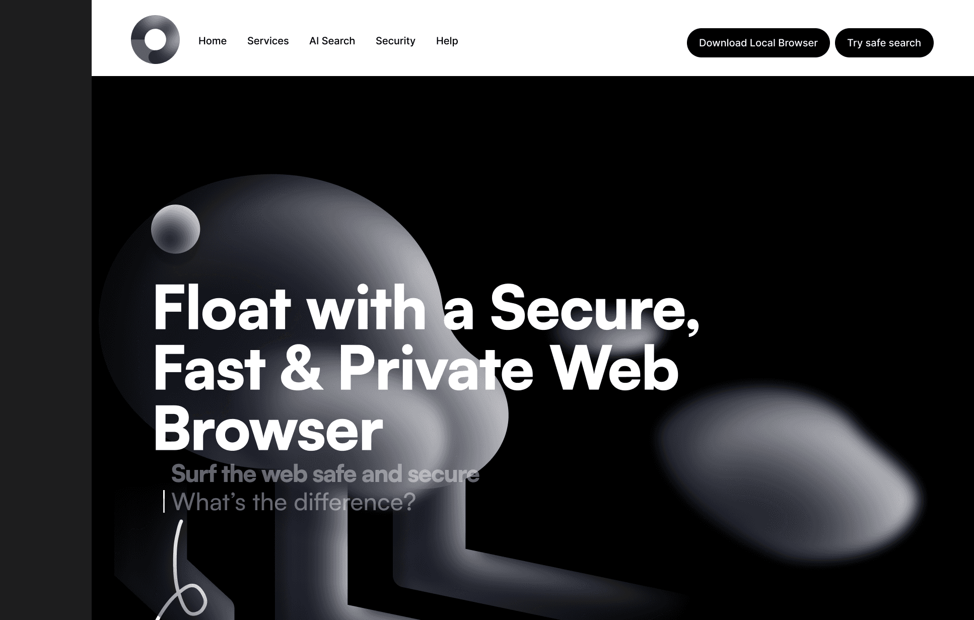
Float — designing trust into the browser
A concept for a secure, fast and private web browser, born from a research question rather than a product brief: people say privacy matters to them — so why do they keep using browsers that harvest their data?
The gap isn't a missing feature — it's a missing understanding
Most people experience online privacy as something that happens to them. Cookie banners are accepted to make them go away. Personalization feels convenient, and its price stays invisible. The browsers with the largest market share are made by companies whose business model depends on the data those browsers collect.
You can't want a privacy-first browser if you don't know what your current browser is doing. That awareness gap became the design brief.
A survey on how people perceive browser privacy
To ground the concept in real attitudes instead of my own assumptions, I ran a survey on privacy-centric browsers (~21 respondents, mixed ages and occupations): browsing habits, awareness, perceived control over personal data, and barriers to switching.
Most respondents felt they had little control over their data in traditional browsers, and many equated privacy with Incognito mode — which does not stop tracking. The most-expected features (ad-blocking, tracking protection, HTTPS, private search, cookie control, VPN) directly shaped Float's feature set. The main reservations were website compatibility, performance, unfamiliarity and cost.
"They use my information and ask for it, and I have to allow cookies. On the other hand, I can not use websites… there is no balance."— Survey respondent
"I don't see myself as an important person, who needs to be tracked."— Survey respondent
"No tracking, no desire to monetise my data, not knowing what I am doing/searching."— Survey respondent
Two attitudes kept recurring and became the informal user lenses for the design: The Resigned, who knows tracking happens and has given up, and The Deliberate, who actively values privacy but finds current tools inconvenient. These lenses are assumption-based syntheses of survey patterns — design hypotheses, not validated personas.
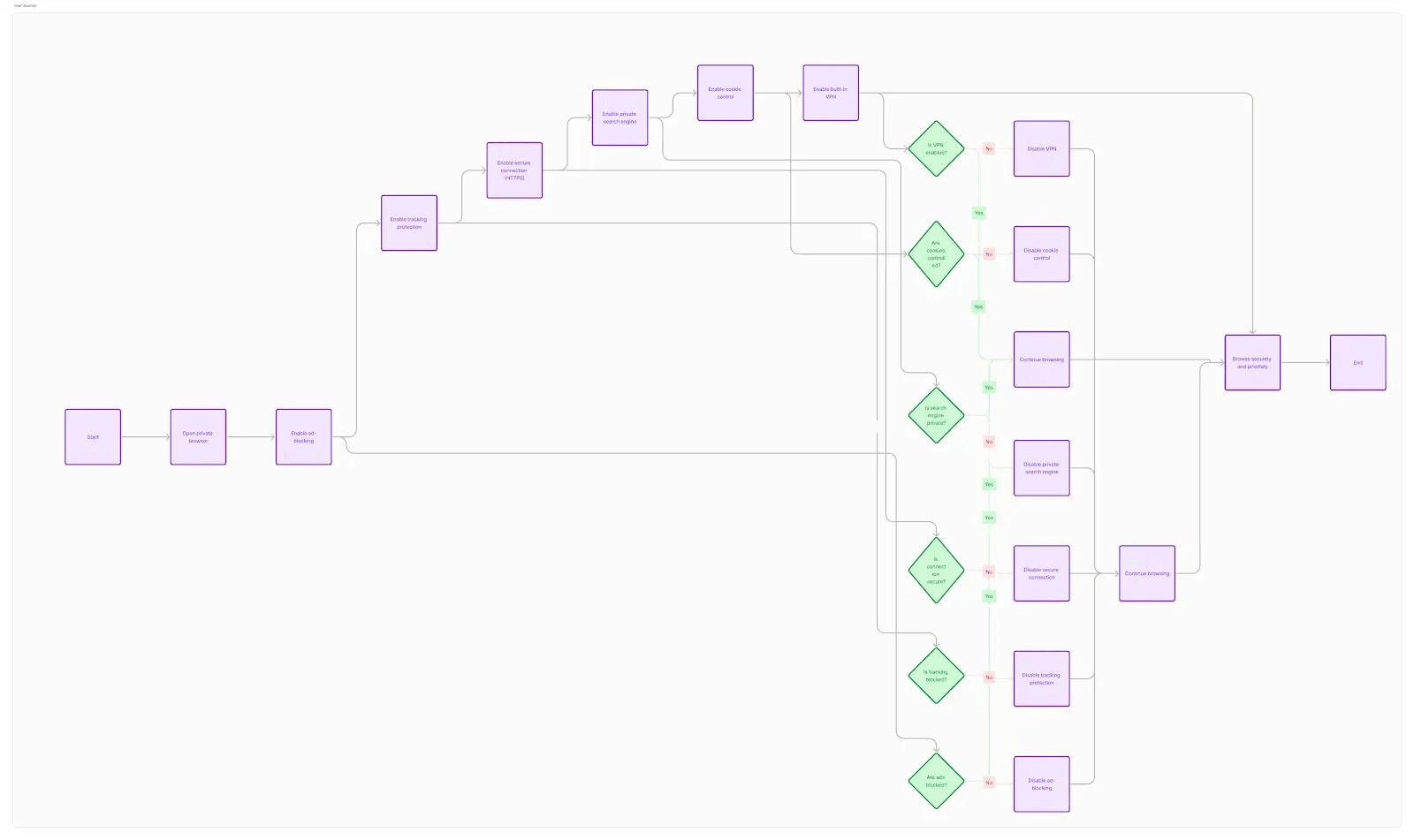
Three principles from the research
A scrollytelling page, because conviction comes before features
The research showed the audience needed a reason to care before a list of features. So the page is built as a narrative in three acts: what you think is happening, what actually happens, and only then — the solution.
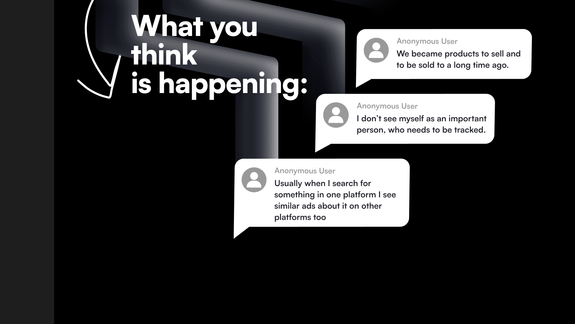
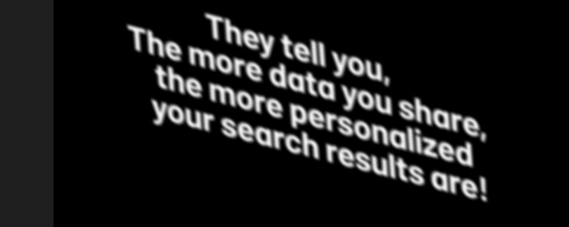


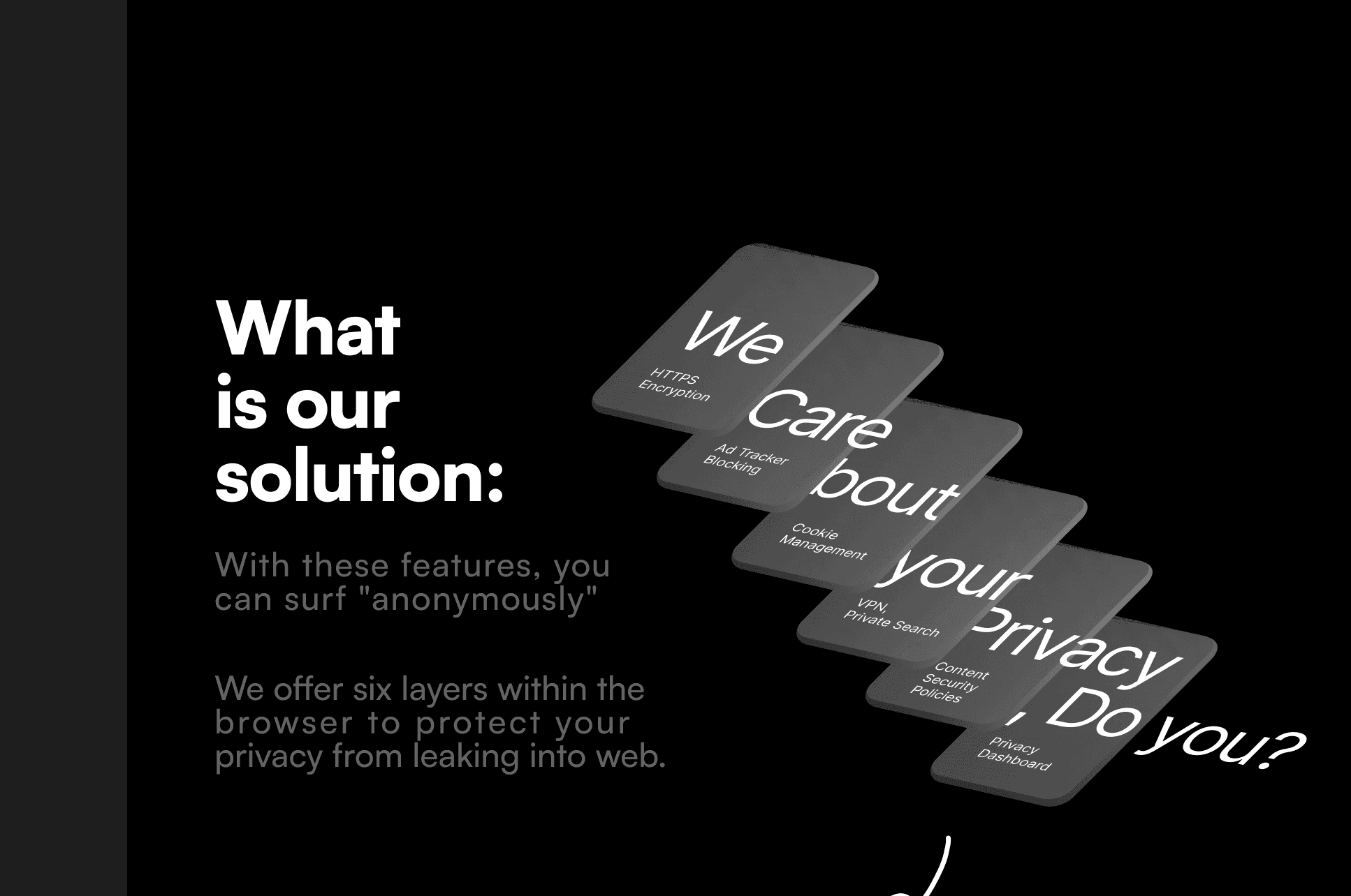
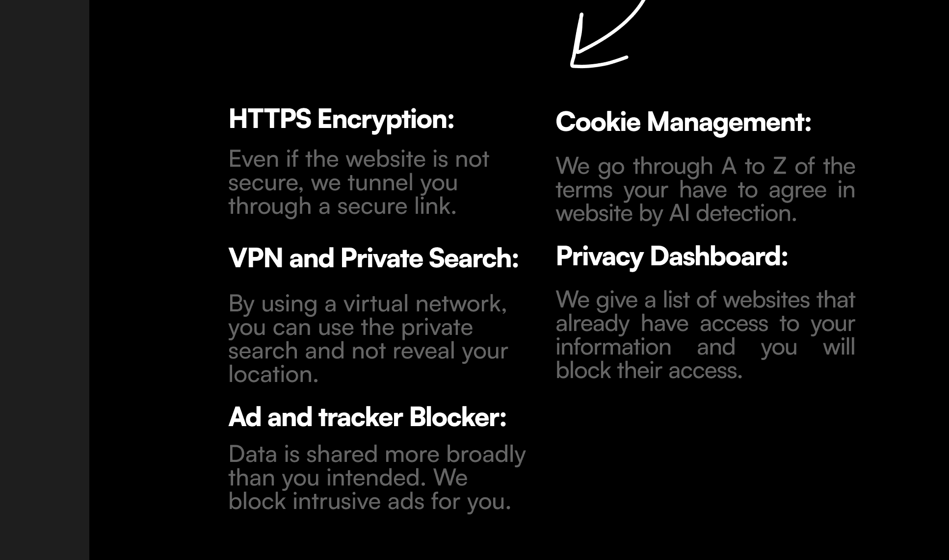
The visual language — deep black space with soft, floating organic forms — came from a moodboard of fluid, cloud-like elements drifting in space: browsing that feels weightless and unobserved. That's also where the name comes from.
Control made visible
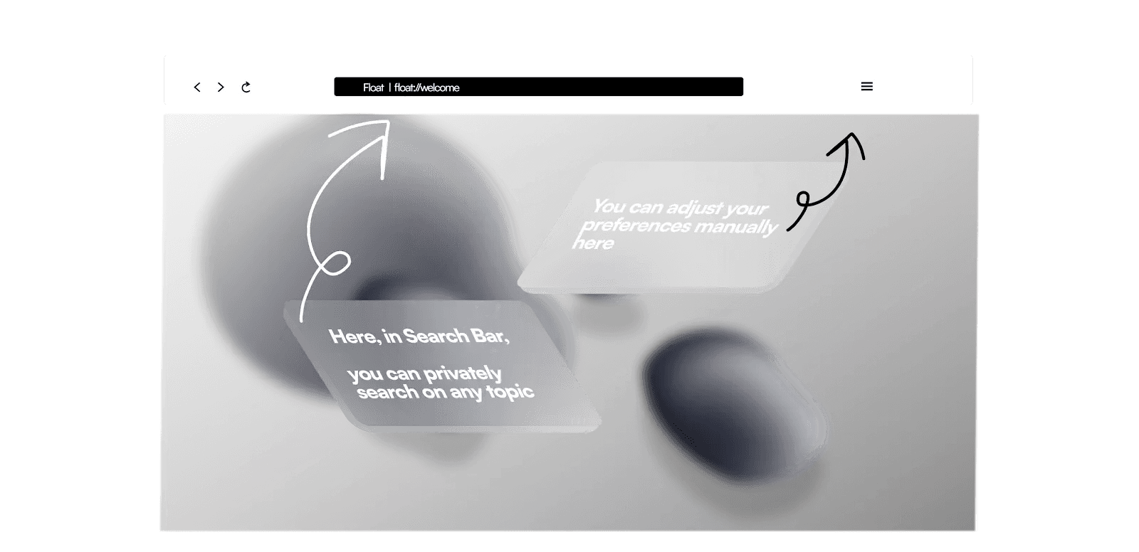
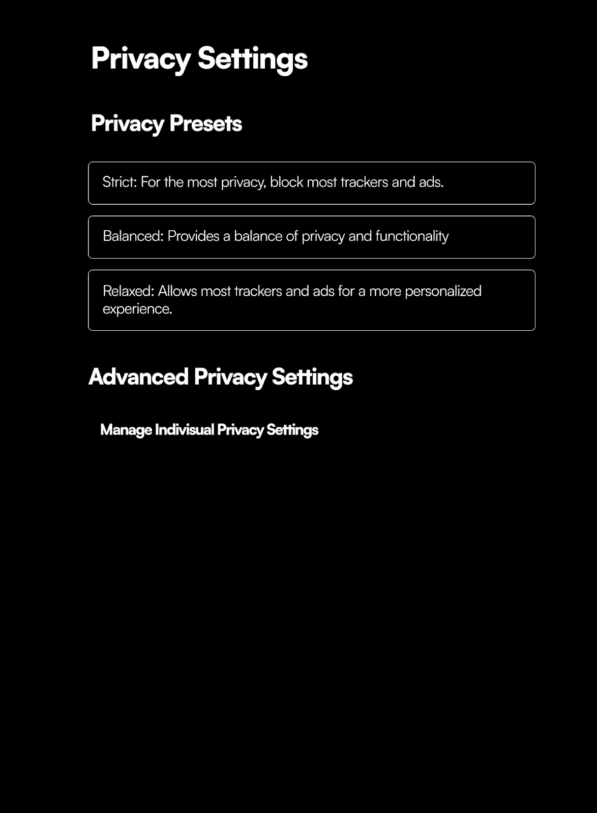
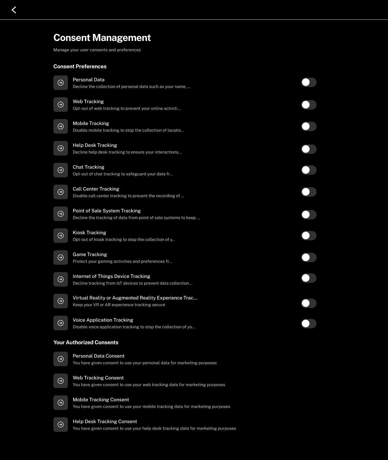
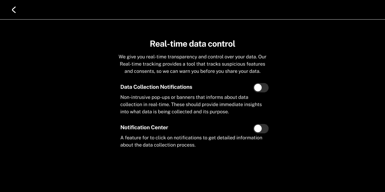
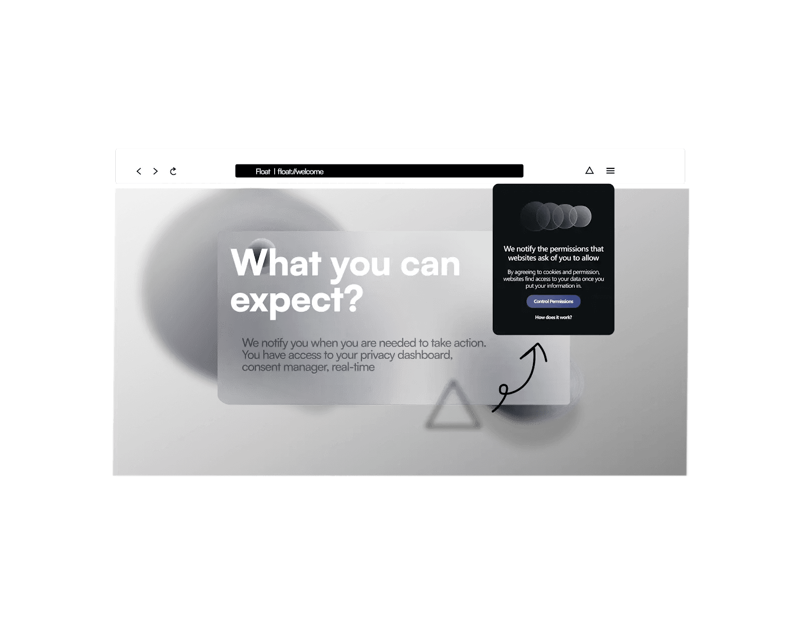
Beyond the landing page, key screens show how the principles would work inside the browser itself — each one answering a fear or expectation from the survey.
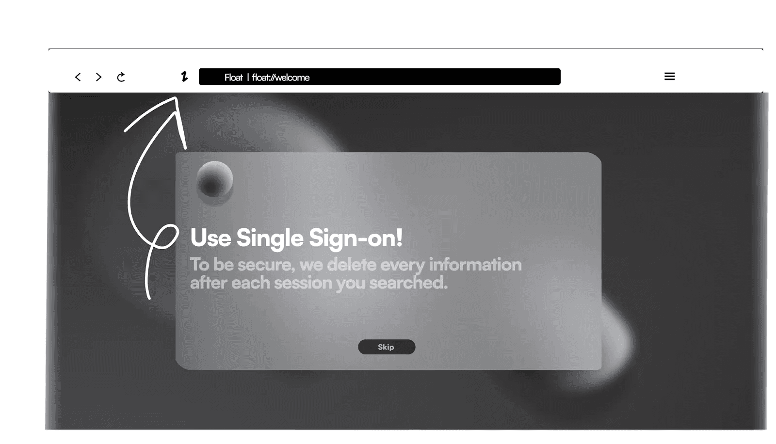
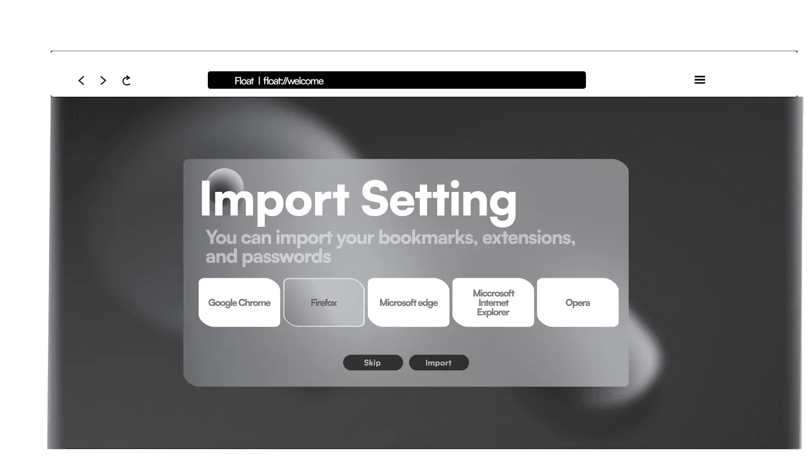
What this project is — and isn't
Float was a conceptual prototype for a research project, and I'd rather be transparent about its limits than imply a process that didn't happen.
These aren't omissions to hide — they define what the next iteration of this work would be.
From concept to validated design
The design problem was belief, not features
Every competitor has an ad-blocker. What people lack is a reason to care, and a feeling of agency once they do. Structuring an entire page around changing someone's mental model — and being honest about where the concept stops and validation should begin — shaped how I've approached every project since.
Neuron — learning that adapts to how your brain works
Neuron is an innovative platform designed specifically for neurodivergent individuals, offering an inclusive and accessible learning environment as well as an assistive organizing tool.
Most interfaces overwhelm the people they should support
Neurodivergent users often experience cognitive overload, difficulty focusing, and heightened sensory sensitivities when using traditional digital interfaces. Most tools aren't designed for the specific needs of people with ADHD, autism, or dyslexia — so accessibility and satisfaction drop exactly where they matter most.
The opportunity: an adaptive, empathetic experience that offers customizable sensory input, intuitive navigation, and emotional support — helping people focus and learn with less strain. Online learning was the perfect place to prove it, because learning is where overload hurts the most.
Grounded in expertise and lived experience
I approached this as a human-computer interaction question, not a visual one. The research had three strands: an expert interview with a specialist on neurodiversity; a competitor analysis of tools already built for neurodivergent users (Brain in Hand, CogniFit, Avaz, Flare, Mightier, Otsimo, Thrive); and a synthesis of the recurring needs across them.
"Neurodivergent users require adaptive, user-centered applications that provide customizable sensory input, intuitive navigation, and emotional support — to manage tasks, focus effectively, and reduce cognitive strain."— Problem statement, research synthesis
Four needs surfaced again and again. They became the lens for every design decision that followed:
Four principles, straight from the research
Neuron: neuroscience, made calm and clear
Neuron turns the principles into a real learning experience. A learner starts on a soft knowledge map — 'I want to learn' — and opens a topic. Inside, a 3D model anchors the subject, and the lesson can be read, heard, or explored. The tagline says the promise plainly: learn at your pace, without stress.
Explore by keyboard, not just by mouse
The idea I'm proudest of: you don't have to hunt around a 3D model with a mouse. Each part of the figure is numbered, and you can move focus with the keyboard — land on a part, and its explanation appears right beside the model. For a learner with motor differences, low vision, or anyone who finds precise mouse-work draining, the content is reachable a calmer way.
It pairs with the other multimodal affordances — text-to-speech audio and a full transcript on every lesson — so the same neuroscience is available however a given brain prefers to receive it. That's inclusive design as a default, not an afterthought bolted on at the end.
What's designed, and what's still ahead
Neuron is a research-driven prototype, and I'd rather be clear about its edges than imply a finished product.
From principled prototype to validated product
Designing for the edges makes it better for everyone
Building for neurodivergent learners changed how I design for anyone. Reducing clutter, offering the same content in more than one form, removing timers and pressure, setting a calm and predictable tone — none of that only helps a 'special' group. It's just better, more humane design. Neuron is where I learned to treat accessibility and empathy as the starting point of a product, not a checklist at the end.